


With thousands of records competing for attention, it’s easy to remember the music and forget why certain covers became cultural shorthand.
The best famous album covers work almost like logos. One image can signal an artist, era, genre, or attitude before a song plays.
This ranking weighs recognition, originality, cultural influence, and staying power, the qualities that separate a cover people glance past from one they never forget.
From pop art and portrait photography to punk graphics and classic rock album covers, these picks show why the most iconic album covers still matter across music, fashion, design, and pop culture.
What Makes an Album Cover Iconic?
An album cover becomes iconic when the image keeps working long after its release campaign ends. Recognition matters, but so does the idea behind the image.
For this ranking, I weighed five things: instant recognition, visual originality, cultural influence, connection to the artist, and long-term relevance. I also considered whether later musicians, designers, photographers, or fashion labels borrowed from the visual language.
Most Famous Album Covers of All Time
The ranking favors recognizability and lasting visual impact rather than album sales or musical quality, spanning everything from pop music to country music and beyond.
The most iconic album covers tend to work at a glance, but they also reward a closer look through symbolism, styling, composition, or cultural context.
1. The Beatles – Abbey Road
Source: The Beatles
Release year: 1969
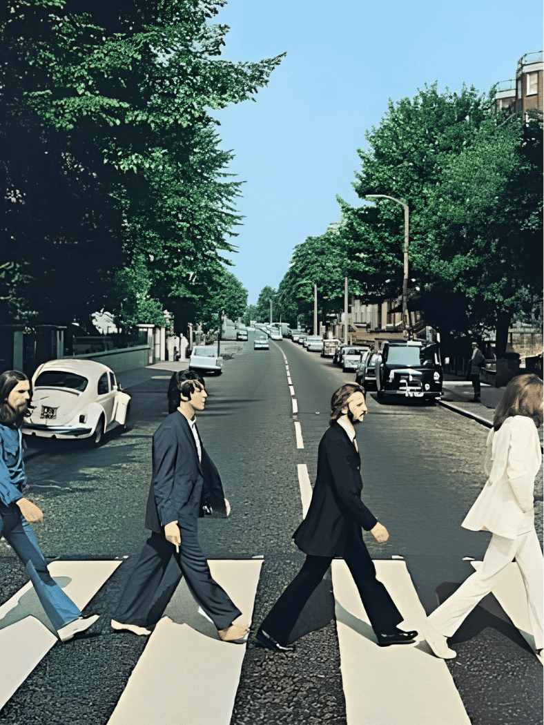
Four Beatles walking across a London zebra crossing sounds almost too simple for a legendary cover. Photographer Iain Macmillan turned that ordinary scene into a perfectly timed image with clean spacing, strong silhouettes, and no visible album title.
Its power comes from repetition. Fans, tourists, advertisers, and other artists have recreated the crossing countless times, making the photograph recognizable far beyond the record itself.
2. Pink Floyd – The Dark Side of the Moon
Source: Pink Floyd
Release year: 1973
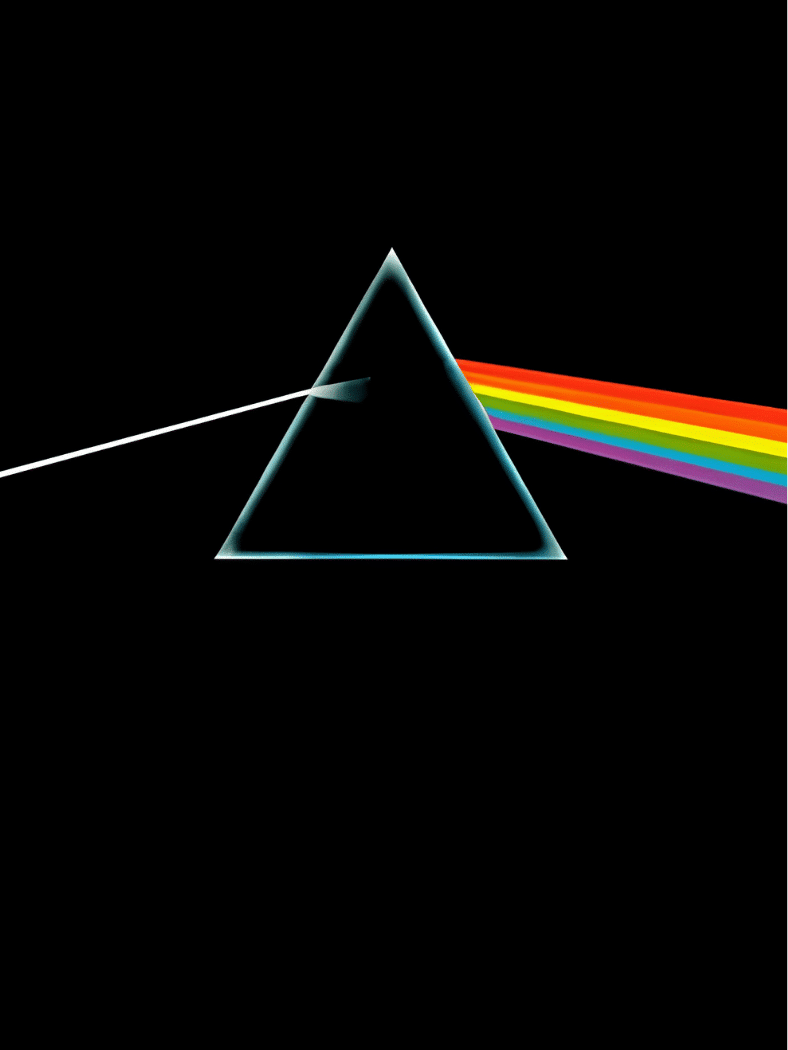
A white beam enters a prism and leaves as a rainbow against a black field. Hipgnosis developed the concept, with George Hardie creating the finished graphic.
The image links light, science, and Pink Floyd’s stage presentation without relying on a band photograph. Its stripped-back geometry made it one of the defining rock album covers, copied and referenced across posters, clothing, logos, and popular culture.
3. The Beatles – Sgt. Pepper’s Lonely Hearts Club Band
Source: The Beatles
Release year: 1967
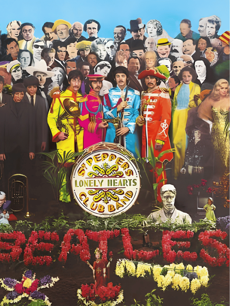
Peter Blake and Jann Haworth built a crowded visual world around the Beatles, placing them among a large group of cultural figures, props, flowers, and brightly colored costumes.
The cover feels theatrical before the record even starts. Its collage format helped push album packaging toward something more ambitious, where the sleeve could function as a cultural statement rather than simple identification.
4. Nirvana – Nevermind

Source: Nirvana
Release year: 1991
Kirk Weddle’s underwater photograph of a swimming baby reaching toward a dollar bill on a fishhook is strange, funny, and unsettling at the same time.
That mix helped the image stick. The cover became closely tied to Nirvana’s breakthrough and the wider grunge era, while the money motif invited interpretations about innocence, desire, and commercial pressure without spelling out a single message.
5. The Velvet Underground & Nico – The Velvet Underground & Nico
Source: The Velvet Underground & Nico
Release year: 1967
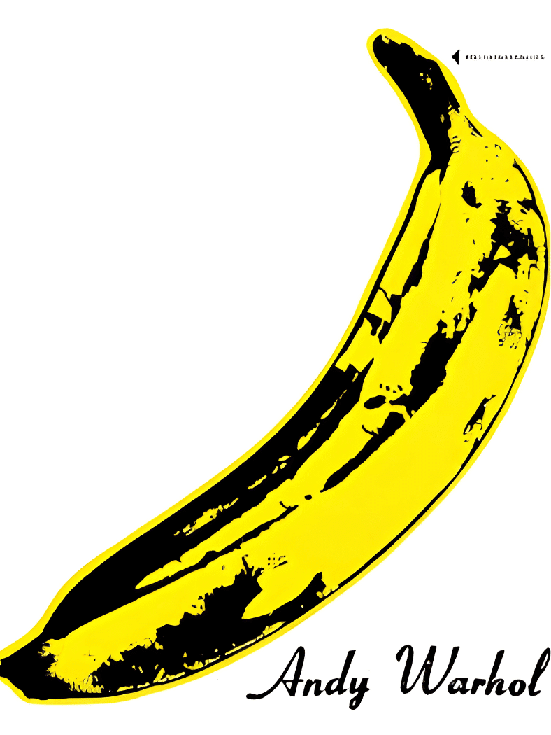
Andy Warhol’s yellow banana sits on a mostly white sleeve with very little else competing for attention. Early copies made the idea even more memorable by allowing owners to peel back the banana sticker.
It is a textbook example of pop art meeting music packaging. The image is playful, provocative, and instantly legible, even to people who have never played the record.
6. The Clash – London Calling
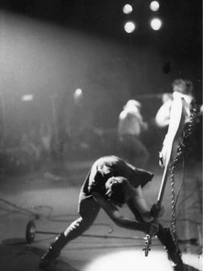
Source: The Clash
Release year: 1979
Pennie Smith captured bassist Paul Simonon smashing his instrument onstage, freezing a burst of frustration and motion that feels almost accidental.
The typography deliberately echoes Elvis Presley’s debut album, giving the cover a visual link between early rock and punk rebellion. That collision of history, movement, and raw performance helped make the sleeve one of punk’s most enduring images.
7. Joy Division – Unknown Pleasures
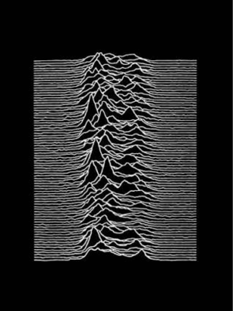
Source: Joy Division
Release year: 1979
Peter Saville placed a white pulsar waveform against a black background and removed the need for a conventional band portrait or loud title treatment.
The result feels scientific, mysterious, and emotionally distant. Over time, the waveform escaped the record sleeve and became a fashion graphic in its own right, appearing on shirts, posters, tattoos, and countless visual references far beyond post-punk audiences.
8. David Bowie – Aladdin Sane
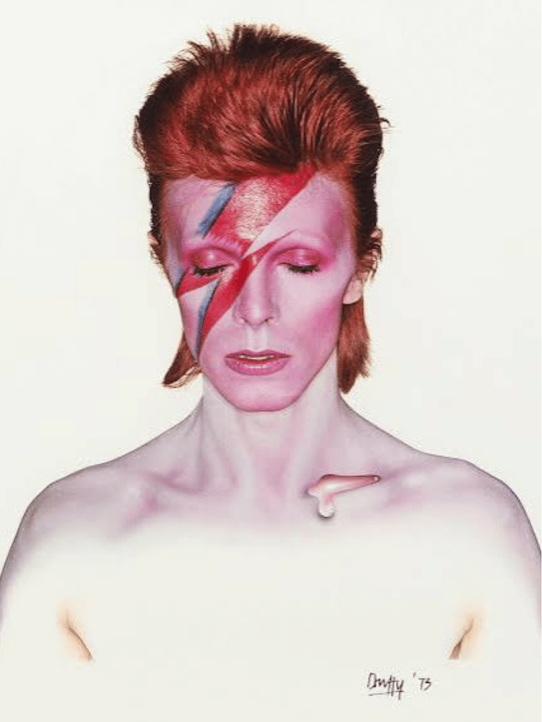
Source: David Bowie
Release year: 1973
Brian Duffy’s portrait of David Bowie, marked by the red-and-blue lightning flash across his face, condensed glam rock into one tightly controlled image.
The makeup, pale skin, closed eyes, and glossy finish make Bowie look both human and constructed. That tension fits an artist known for changing personas, and the portrait remains one of the clearest visual symbols of his career.
9. Fleetwood Mac – Rumours
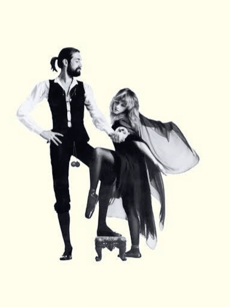
Source: Fleetwood Mac
Release year: 1977
The cover places Mick Fleetwood and Stevie Nicks in theatrical poses against a simple studio background, allowing costume, gesture, and body language to carry the image.
It is less visually crowded than many 1970s sleeves, which helps the unusual styling stand out. The photograph became inseparable from the album’s identity and reflects the band’s mix of polished songwriting, mystique, and stage personality.
10. The Rolling Stones – Sticky Fingers
Source: The Rolling Stones
Release year: 1971
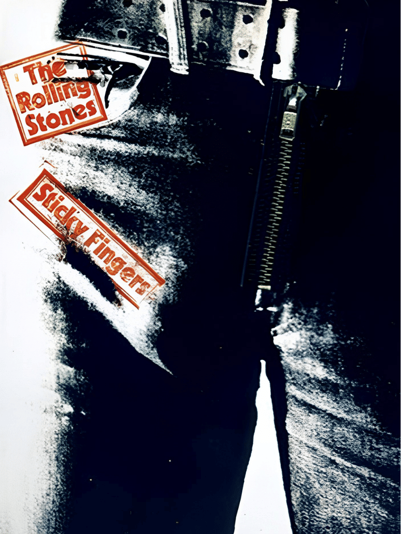
The close-up jeans concept associated with Andy Warhol turned a body, clothing, and packaging into one provocative design. The original sleeves famously included a working zipper.
That physical detail made the record interactive, something a flat digital thumbnail cannot fully reproduce. The cover also helped cement the Rolling Stones’ relationship with sexuality, fashion, and visual provocation, all through a tightly cropped image.
11. Prince – Purple Rain
Source: Prince
Release year: 1984
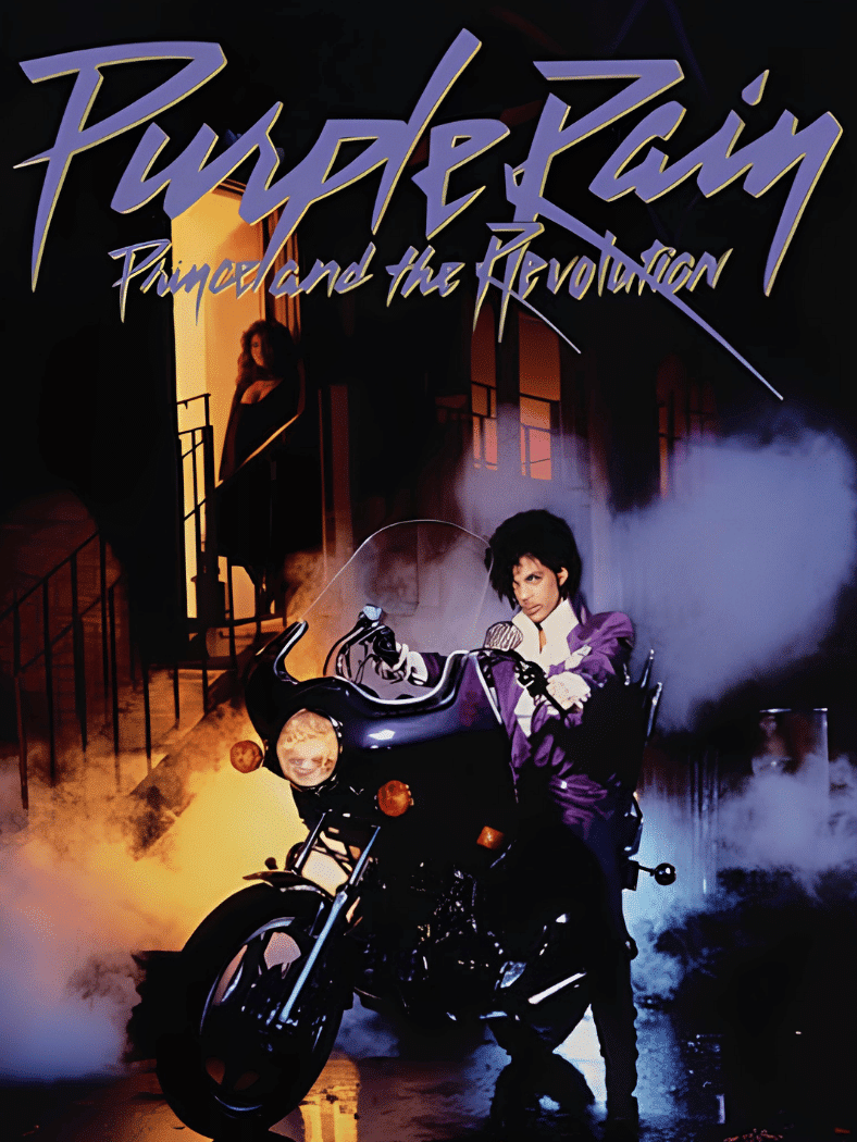
Prince appears on a motorcycle in a purple-lit, cinematic setting that feels halfway between a concert fantasy and a movie poster.
That is exactly why the artwork works. It connects the album to the Purple Rain film while presenting Prince as a fully formed superstar character. Motorcycle, costume, lighting, and typography all reinforce the glamorous visual world surrounding the project.
12. Bruce Springsteen – Born in the U.S.A.
Source: Bruce Springsteen
Release year: 1984
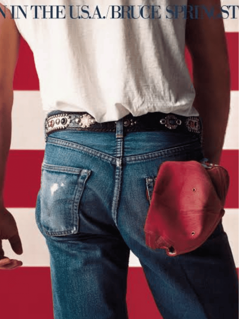
Annie Leibovitz photographed Springsteen from behind in worn denim against the American flag. The composition is straightforward, but every element carries cultural weight.
Jeans, cap, flag, and red-white-and-blue styling create an unmistakably American image. Its apparent simplicity also leaves room for interpretation, which mirrors the tension between patriotic imagery and the album’s more complicated view of American life.
13. N.W.A – Straight Outta Compton
Source: Straight Outta Compton
Release year: 1988
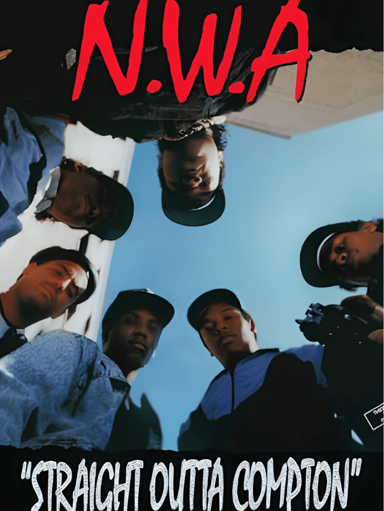
The group looks downward toward the camera from a low-angle perspective, placing the viewer in a physically vulnerable position.
That point of view makes the cover confrontational before any lyric is heard. The raw street-photography feel matched N.W.A’s public image and helped establish a visual language later used across gangsta rap and hip-hop photography: direct, unsmiling, and intentionally intimidating.
14. The Notorious B.I.G. – Ready to Die

Source: Warner Music Store
Release year: 1994
A baby sits against a plain white background, leaving almost nothing in the frame except the child and the album title.
The image gains power from contrast. An innocent infant paired with a title about death immediately creates tension around life, identity, and mortality. Its minimalism made the sleeve unusually easy to recognize and helped it become a landmark of 1990s hip-hop design.
15. A Tribe Called Quest – The Low End Theory

Source: A Tribe Called Quest
Release year: 1991
A painted figure in red and green stands against a deep black background, creating a bold Afrocentric visual identity with very little visual clutter.
The color palette became closely associated with A Tribe Called Quest and continued across later artwork. Its strength lies in consistency: body, color, and silhouette work together as branding while still feeling expressive, rhythmic, and unmistakably tied to the group.
16. Miles Davis – Bitches Brew

Source: Miles Davis
Release year: 1970
Mati Klarwein’s surreal painting combines faces, water, fire, sky, plants, and cosmic forms in one dense, dreamlike composition.
The cover does not try to explain itself quickly. Instead, its flowing shapes and psychedelic atmosphere mirror the album’s experimental fusion of jazz, rock, and electric texture. It remains a standout example of painted album art functioning as an extension of musical mood.
17. Metallica – Master of Puppets

Source: Metallica
Release year: 1986
Don Brautigam’s artwork shows a field of white crosses tied to puppet strings, turning the album title into a blunt visual metaphor.
The scene connects control, death, obedience, and manipulation without needing a literal band image. Its red sky and cemetery imagery helped establish one of heavy metal’s most familiar visual identities while giving the cover a narrative that can be understood instantly.
18. Led Zeppelin – Led Zeppelin
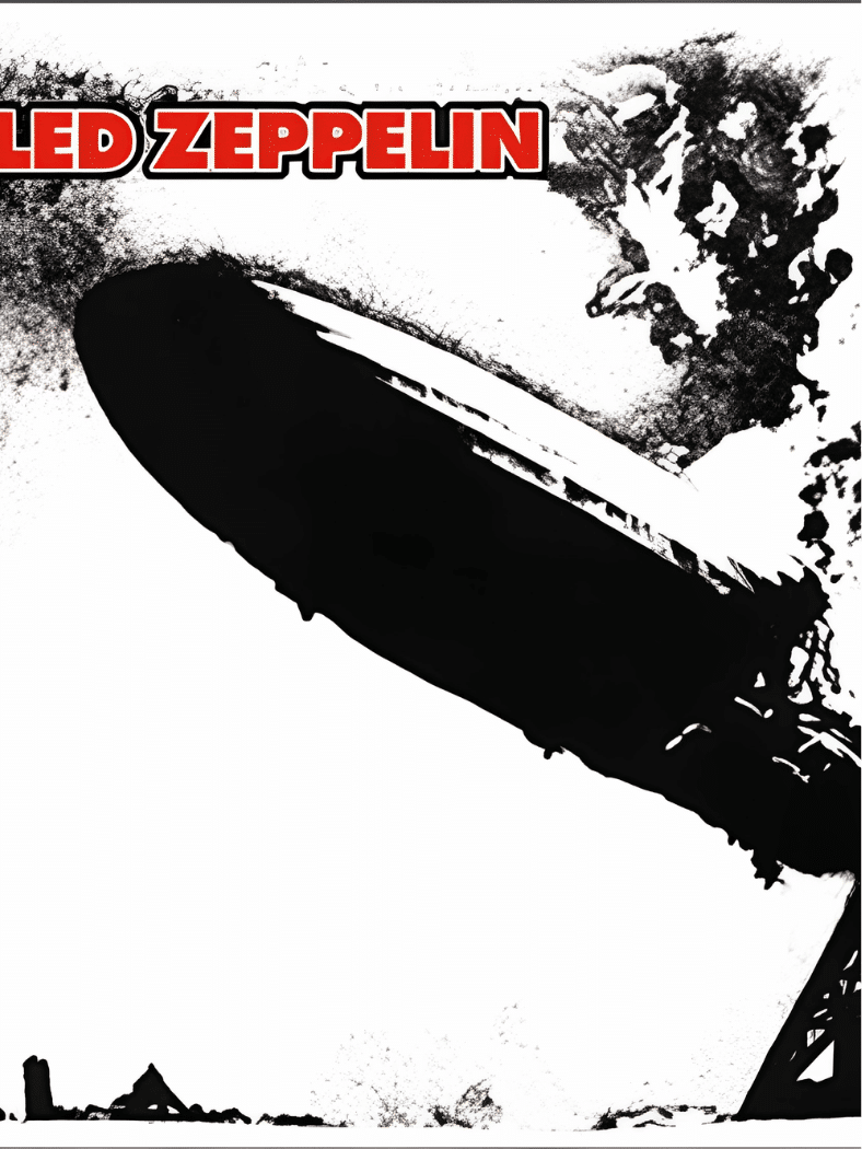
Source: Led Zeppelin
Release year: 1969
The Hindenburg disaster photograph, rendered in stark monochrome, gives Led Zeppelin’s debut a sense of catastrophe and impact before the band is even introduced visually.
The concept also plays directly with the group’s name. That combination of historical image, wordplay, and aggressive simplicity created a sleeve that fit early hard rock while avoiding the portrait-driven format common to many debut albums.
19. Elvis Presley – Elvis Presley
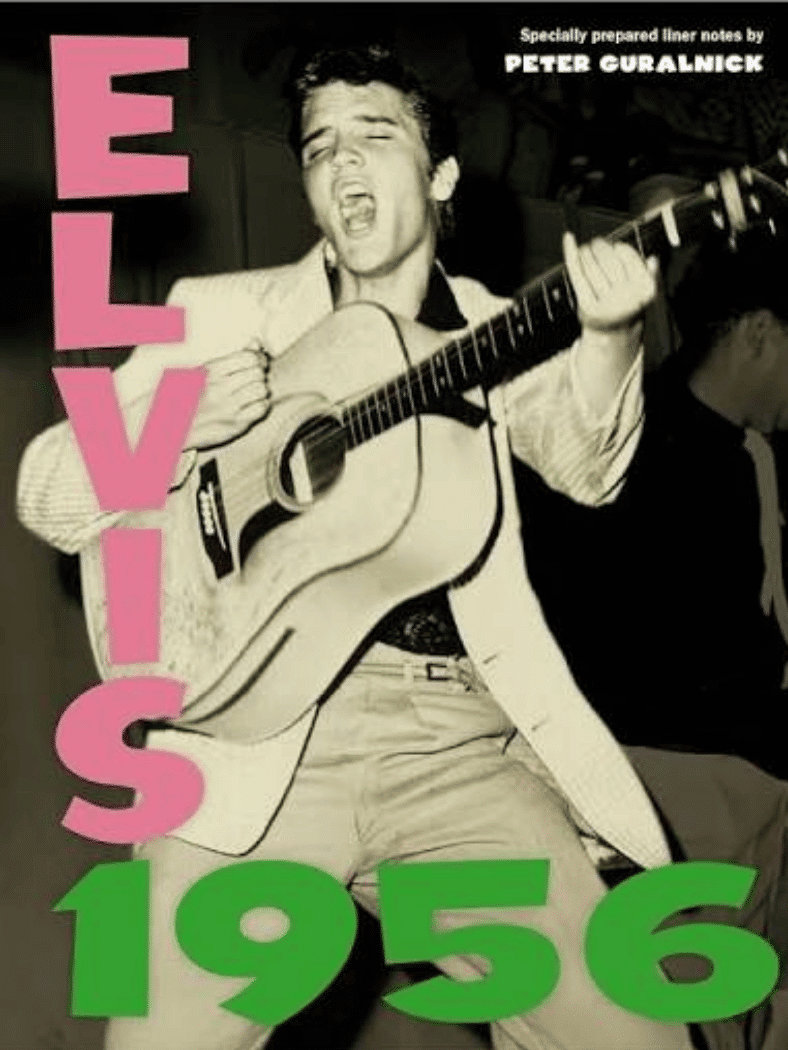
Source: Elvis Presley
Release year: 1956
Elvis is caught mid-performance in a high-energy black-and-white photograph, while bright pink and green lettering gives the sleeve a rough, immediate punch.
The design became influential enough that London Calling echoed its typography decades later. It captures early rock and roll as something physical and disruptive, with the performance image doing more work than a polished studio portrait ever could.
20. Ramones – Ramones
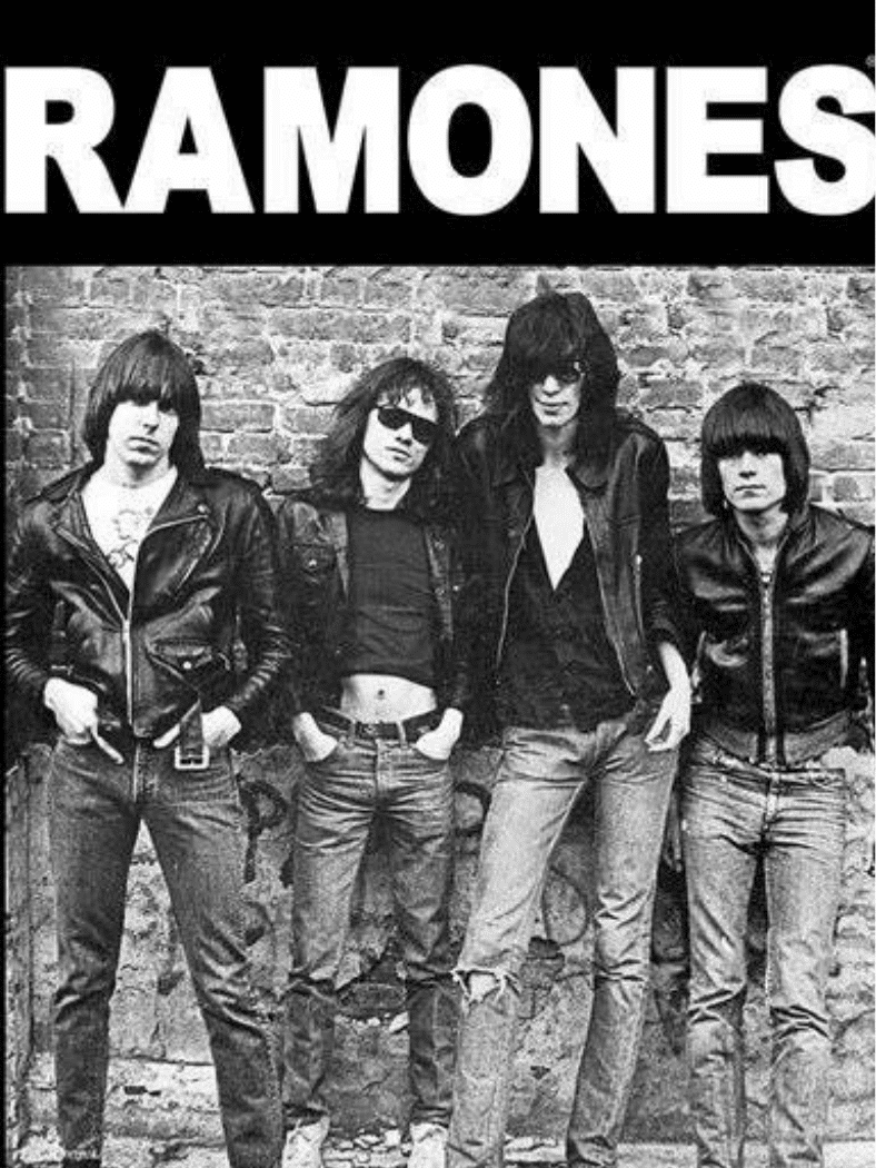
Source: Ramones
Release year: 1976
Roberta Bayley’s photograph places the four Ramones against a brick wall in jeans, sneakers, and leather jackets. Nothing looks expensive or overproduced.
That plainness became the point. The image helped define the visual uniform of American punk: direct, urban, inexpensive, and cool without looking carefully styled. Countless band portraits have since borrowed the same wall-and-lineup simplicity.
21. Patti Smith – Horses

Source: Patti Smith
Release year: 1975
Robert Mapplethorpe photographed Patti Smith in a plain white shirt and dark jacket against a light background, creating an image that feels intimate rather than theatrical.
The androgynous styling, direct gaze, and lack of decorative clutter challenged conventional expectations of how women in music should be presented. Its influence reaches beyond punk into fashion photography, portraiture, and celebrity image-making.
22. Kendrick Lamar – To Pimp a Butterfly
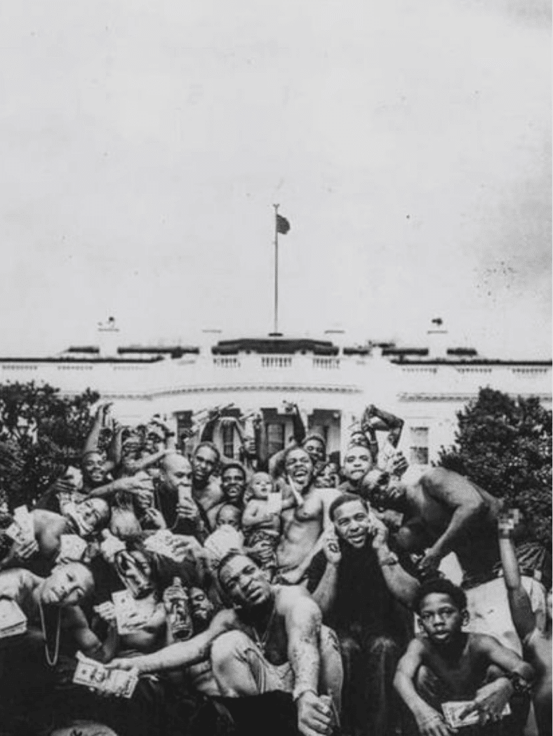
Release year: 2015
A large group of Black men and children gathers outside the White House in a stark monochrome photograph, creating an image loaded with political and social symbolism.
The setting makes power part of the composition. Celebration, confrontation, race, status, and American identity all sit inside one frame. The cover became one of modern hip-hop’s most discussed images because its meaning extends beyond artist branding.
23. Grace Jones – Island Life

Source: Grace Jones
Release year: 1985
Jean-Paul Goude presents Grace Jones in an apparently impossible pose, using a composite photographic technique to stretch movement beyond normal anatomy.
The result fits Jones perfectly: fashion, performance art, music, and constructed celebrity identity all merge in one image. The cover remains influential because it does not merely document the artist. It builds a larger-than-life visual character around her.
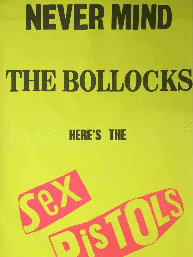
24. Sex Pistols – Never Mind the Bollocks, Here’s the Sex Pistols
Source: Sex Pistols
Release year: 1977
Jamie Reid used loud yellow and pink, ransom-note typography, and deliberately abrasive graphic choices instead of a polished band photograph.
The cover looks like a protest poster pasted over something respectable. That visual aggression became shorthand for British punk, where design itself could feel anti-establishment. Even at thumbnail size, the color clash and cut-and-paste lettering remain difficult to mistake.
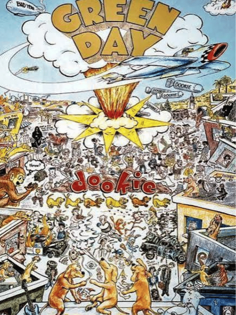
25. Green Day – Dookie
Source: Green Day
Release year: 1994
Richie Bucher’s comic-style illustration fills the sleeve with explosions, characters, jokes, signs, and chaotic details that reward repeated viewing.
The artwork matches Green Day’s irreverent energy without relying on a standard band portrait. Its dense humor ties the album to 1990s pop-punk culture, while the hand-drawn style gives the record a mischievous personality before the music begins.
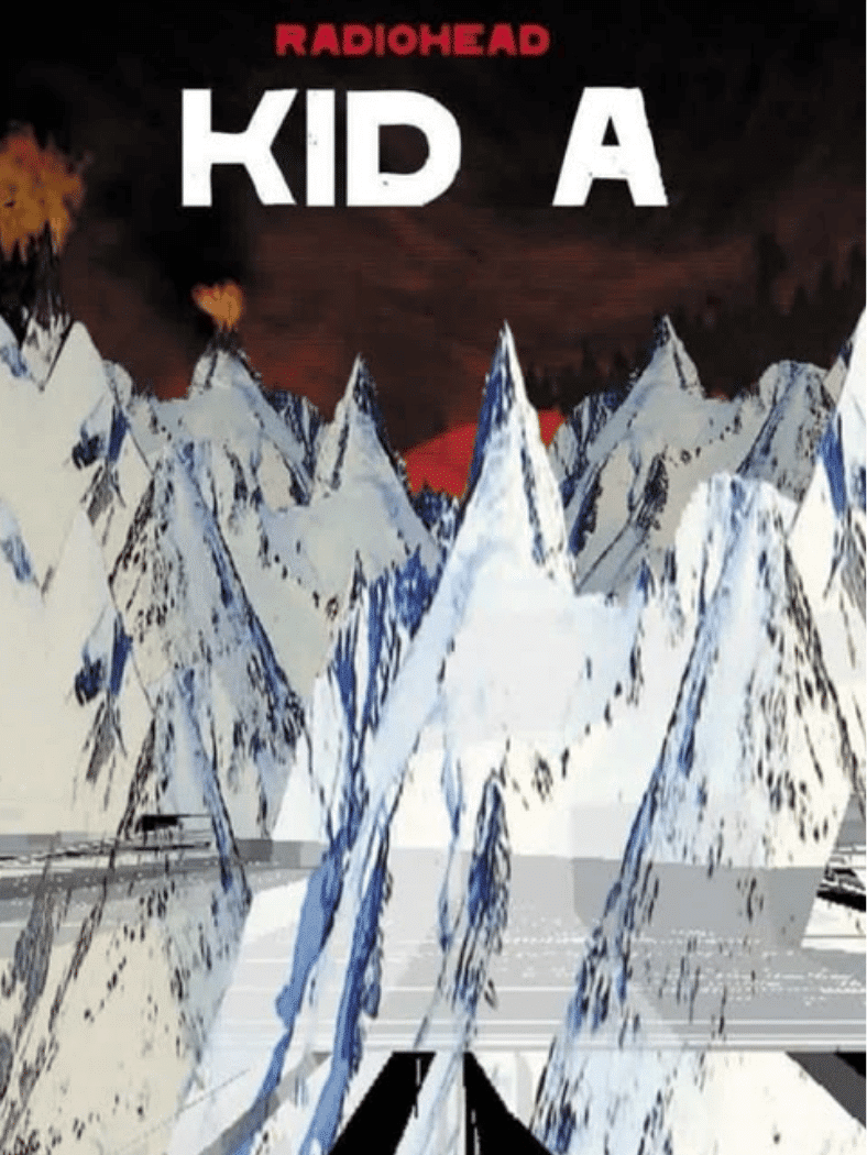
26. Radiohead – Kid A
Source: Radiohead Bandcamp
Release year: 2000
Stanley Donwood and Thom Yorke created a jagged mountain landscape that feels digital, cold, and unstable. The image avoids the warmth or familiarity of traditional rock photography.
That distance suits an album built around a dramatic musical shift. The landscape became a visual counterpart to early-2000s anxiety about technology, conflict, and disconnection, giving the sleeve an atmosphere that feels more important than any single symbol.
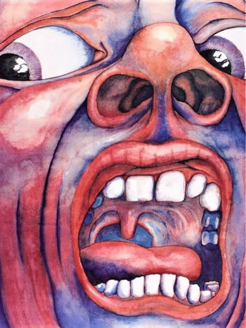
27. King Crimson – In the Court of the Crimson King
Source: DGM Live
Release year: 1969
Barry Godber’s painted face fills almost the entire cover, mouth open and eyes wide in a scream that is difficult to ignore.
No conventional front-cover typography softens the impact. The intense red, blue, and flesh tones make the portrait feel surreal and emotionally overloaded, helping the sleeve become one of progressive rock’s most recognizable pieces of visual art.
28. The Roots – Things Fall Apart
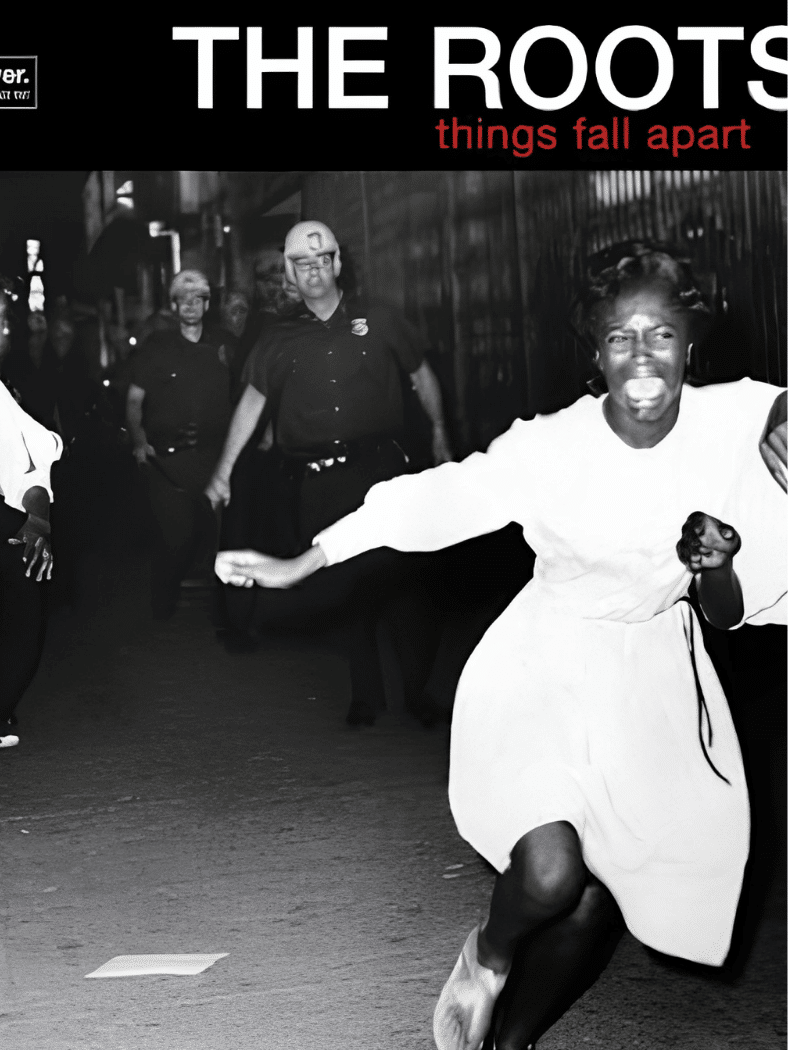
Source: Interscope Records
Release year: 1999
The cover uses a historic black-and-white photograph from the civil rights era, creating immediate discomfort rather than glamour.
That choice gives the album historical and social weight before a listener reaches the track list. The photograph’s emotional force also separates the sleeve from conventional promotional imagery, using documentary history as part of the record’s wider cultural conversation.
29. Frank Ocean – Blonde

Source: Blonded
Release year: 2016
Wolfgang Tillmans photographed Frank Ocean with green hair, one hand covering his face, creating a portrait that feels private even as it circulated widely.
The gesture resists the usual demand for direct celebrity visibility. That makes the image fit the album’s themes of memory, vulnerability, identity, and distance. Its quiet composition became a defining visual of modern R&B and internet-era music culture.
30. Gorillaz – Demon Days

Source: Gorillaz
Release year: 2005
Jamie Hewlett’s four illustrated portraits present the virtual band in a clean grid, turning character design into album identity.
The composition is simple, but each face carries a distinct personality. It works especially well for Gorillaz because the band’s visual world is inseparable from the music. The sleeve also shows how animation can create celebrity imagery without a conventional human band portrait.
How Album Covers Became Part of Music History
Vinyl gave artists a large square canvas, and designers used it for photography, painting, collage, illustration, typography, and increasingly experimental packaging. As formats shrank from LPs to CDs and then digital thumbnails, the best artwork kept its identity.
Many famous album covers also escaped the record itself. They moved onto posters, T-shirts, fashion collections, memes, tattoos, and merchandise. An interest in fashion history and vintage movie posters makes that crossover especially noticeable: strong music artwork often borrows the same visual tricks as film promotion, from dramatic portraiture to instantly readable symbols.
That legacy is why classic rock album covers and newer digital-era sleeves can still compete for attention on the same screen.
Final Thoughts
Thirty covers, five decades, and one clear pattern: the most famous album covers rarely explain themselves.
A banana, a crosswalk, a baby underwater, each image trusted a single idea to do all the talking. That restraint is what turned packaging into permanent culture, outliving chart positions and even the music itself.
Rankings like this are built to be argued with. Some covers earn their spot through shock, others through quiet confidence.
Which one would you put at No. 1? Drop your pick, or your favorite left off this list, in the comments below.
Frequently Asked Questions
Can the Same Album Have Different Covers in Different Countries?
Yes. Different countries or editions can use alternate artwork because of licensing, censorship, marketing choices, or local release strategies. Collectors often value these variations when they are scarce or visually distinctive.
Who Owns the Copyright to An Album Cover?
Album cover copyright usually belongs to the photographer, illustrator, designer, record label, or another rights holder under a contract. Ownership depends on who created the artwork and the agreement governing its use.
Are Alternate Album Covers Valuable to Collectors?
Alternate covers can become collectible when they are limited, withdrawn, misprinted, censored, or tied to a specific pressing. Rarity matters, but demand, condition, artist popularity, and historical significance also influence value.