

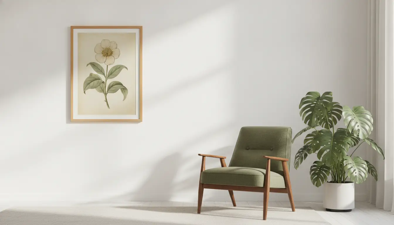
Vintage artwork occupies a complicated position in contemporary interiors. It draws its appeal from the visual language of earlier decades, yet the most successful examples do not make a room feel trapped in another time. A railway poster, botanical plate, archival photograph, or midcentury advertisement can introduce history, texture, and character without turning a home into a period display. That effect depends on more than faded colors or familiar retro imagery. Authenticity emerges when historical references, artistic choices, physical presentation, and modern surroundings support one another. When those elements are handled thoughtfully, vintage artwork feels collected and enduring rather than old-fashioned.
The growing availability of historical reproductions and vintage-inspired designs has made that distinction more important. Buyers no longer need to search antique markets or specialist auctions to introduce period imagery into their homes. They can choose from restored archives, licensed reproductions, contemporary reinterpretations, and digitally printed works offered in a wide range of formats. This accessibility has expanded the audience for vintage art, but it has also produced a crowded market in which thoughtful design often sits beside superficial imitation. A work can resemble something old without possessing the coherence that makes historical imagery believable. The challenge is to identify the qualities that give vintage artwork a convincing connection to the past while allowing it to function naturally in the present.
Authenticity Begins With Historical Specificity
Vintage artwork feels convincing when it reflects the visual habits of a recognizable period rather than combining unrelated symbols associated with the past. Every era developed a distinct approach to lettering, illustration, photography, composition, and commercial communication. Art Deco posters used geometry and elongated forms differently from Victorian advertisements, while midcentury graphics favored simplified shapes, energetic layouts, and optimistic color relationships. These distinctions matter because viewers are often more visually perceptive than they realize. A person may not be able to identify the precise decade represented, but inconsistencies in typography, clothing, color, or composition can still make an image feel false. Historical specificity gives the work an internal logic that allows each visual choice to support the others.
The original purpose of an image also contributes to its authenticity. A railway poster was not created simply to decorate a wall, but to promote transportation, tourism, and a modern ideal of leisure. Botanical illustrations combined aesthetic precision with the scientific desire to observe, classify, and document the natural world. Commercial advertisements revealed changing attitudes toward convenience, domestic life, status, and consumption. When an artwork preserves some connection to these original functions, it carries more intellectual and emotional weight. It becomes evidence of how people in another period understood beauty, progress, aspiration, or everyday life. That context prevents vintage imagery from becoming a loose collection of retro motifs.
For many buyers, the path from historical appreciation to ownership now runs through curated online art marketplaces. iCanvas, a Chicago-based wall art company, brings together ready-to-hang works from independent artists, licensed estates, and cultural institutions across canvas, fine art paper, acrylic glass, wood, and metal. Shoppers interested in the visual language of earlier decades can explore its vintage and retro wall art, where midcentury travel posters, retro advertisements, botanical illustrations, classic entertainment imagery, Art Deco geometry, and 1960s-inspired graphics appear, alongside faded primary colors, warm creams, aged paper tones, and soft pastels. The breadth of the collection makes the reference feel purposeful, since it shows how historically grounded subjects and palettes can bring personality to modern living rooms, kitchens, home bars, and hallways.
Patina Should Suggest a Past, Not Perform One
Patina is one of the most recognizable features associated with vintage artwork, but it is also among the easiest to misuse. Genuine aging produces irregularity through exposure to light, moisture, handling, dust, and changes in the materials themselves. Paper may yellow more intensely near its edges, pigments can fade unevenly, and small abrasions may appear where an object was repeatedly touched or moved. These effects are usually subtle and inconsistent. Artificial distressing often fails because it applies the same scratches, stains, and faded patches too evenly. When every corner appears identically worn, the surface begins to look theatrical rather than historical.
Authentic-looking patina supports the image instead of competing with it. A softly muted palette can reinforce the mood of an archival photograph or an old tourism poster. Slightly imperfect registration can make a reproduced lithographic design feel closer to the printing process that originally produced it. By contrast, exaggerated cracks and heavy brown filters can make an image look older without making it more believable. Excessive aging becomes a costume placed on top of the artwork. The viewer notices the effect before noticing the subject, which weakens the sense that the object has a real visual history.
Restraint is therefore essential. A vintage piece does not need to appear damaged in order to feel authentic, and some historical works were preserved with remarkable care. Clean colors, crisp lines, and intact surfaces can be entirely appropriate for designs associated with modernism, luxury advertising, or institutional collections. The goal is not to simulate neglect. It is to communicate material truth, whether that truth involves fading, precision, roughness, or refinement. Patina works best when it appears to be the natural consequence of the artwork’s imagined life rather than a decorative shortcut.
Material Choices Shape the Viewer’s Belief
The physical presentation of vintage artwork has a powerful influence on whether it feels credible. Paper, canvas, wood, metal, acrylic, and glass each carry different associations and interact differently with historic imagery. A scientific illustration printed on textured fine art paper may feel closer to an archival plate than the same image presented on a highly reflective surface. A bold midcentury graphic, however, may benefit from a smooth finish that emphasizes its clean shapes and saturated colors. Material should reinforce the visual identity of the artwork. When the medium and the image appear disconnected, the result can feel decorative but emotionally unconvincing.
Scale also affects material perception. Small works invite close inspection, making paper texture, printing detail, and frame construction especially noticeable. Larger pieces function more architecturally and must sustain visual credibility from across a room. A poster enlarged far beyond its original proportions can reveal weaknesses in image quality or typography. Conversely, a carefully reproduced design can gain new impact when presented at a size that suits contemporary walls. Authenticity does not require rigid adherence to original dimensions, but it does require sensitivity to how enlargement changes the work’s character.
Framing decisions complete the material story. Ornate gilded frames can support certain portraits, landscapes, and classical studies, but they may overwhelm an understated commercial print. Simple wood frames often complement folk art, natural history imagery, and early modern graphics without forcing them into a formal category. Metal frames can sharpen the appearance of industrial photography or twentieth-century typography. Matting can create visual breathing room and protect delicate work, though oversized mats may make modest images feel overly precious. The most persuasive presentation allows the artwork’s period character to remain visible while adapting it to the practical demands of a modern home.
Composition Matters More Than Nostalgic Symbols
Many unsuccessful vintage-inspired works rely too heavily on obvious period symbols. Old bicycles, record players, classic automobiles, rotary telephones, and faded brand labels can communicate nostalgia quickly. Yet the presence of these objects alone does not create authentic design. A convincing composition must also reflect how artists and commercial designers of the relevant period organized space. The placement of text, the relationship between foreground and background, and the use of negative space all contribute to the artwork’s credibility. Without those structural qualities, nostalgic objects become props.
Historical composition was often shaped by practical limitations. Early posters needed to communicate from a distance, which encouraged bold silhouettes, compressed perspectives, and limited text. Magazine illustrations had to accommodate columns, captions, and page dimensions. Product labels used borders and decorative lettering to distinguish goods on crowded shelves. Photographers worked with slower equipment, different film characteristics, and formal conventions that affected posture and framing. These constraints produced distinctive visual rhythms that cannot be replicated simply by adding a sepia filter.
Strong vintage artwork therefore feels designed rather than assembled. Its components lead the eye through the image with a clear hierarchy. Typography supports the illustration instead of floating above it as an afterthought. Decorative elements repeat with purpose, while empty areas provide emphasis and balance. Even highly detailed works maintain an internal order. When modern artists understand these principles, they can create historically informed pieces that feel plausible without becoming literal copies of existing artifacts.
Color Should Reflect Printing History and Emotional Intent
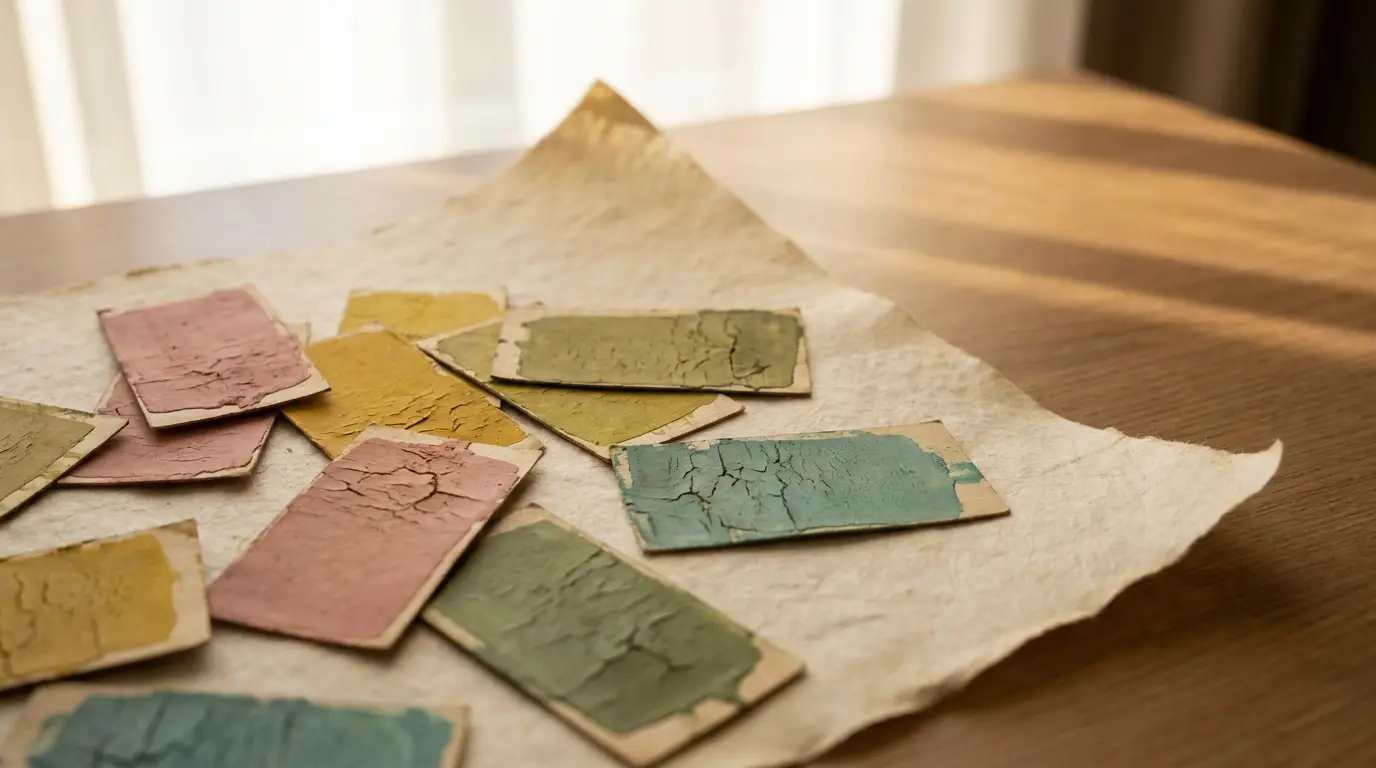
Color is often the first feature viewers associate with a particular era. Dusty rose, mustard yellow, teal, olive, burnt orange, cream, and muted red are frequently used to signal vintage style. Yet authentic color depends on more than selecting a familiar palette. Historical hues were influenced by available pigments, printing technologies, paper quality, exposure to light, and the economics of production. Some posters used only a few colors because each additional printing plate increased complexity and cost. These limitations often created stronger, more disciplined designs than a modern unlimited palette would produce.
A credible vintage palette also reflects the emotional purpose of the work. Tourism posters often used luminous blues, warm yellows, and idealized landscapes to promise escape. Wartime graphics relied on urgent reds, dark neutrals, and forceful contrasts to command attention. Midcentury domestic advertising frequently used cheerful pastels to associate consumer products with comfort and optimism. Scientific illustrations favored naturalistic colors that supported observation and classification. When palette and purpose align, the artwork feels embedded in its historical context rather than merely styled to look old.
Modern reproduction introduces another challenge because screens, digital files, and contemporary printers can intensify colors beyond their original appearance. Overly bright saturation may erase the softness associated with aged inks and absorbent paper. At the same time, excessive muting can make every period look uniformly brown and faded. Authenticity requires a balance between historical restraint and visual vitality. The color should remain expressive enough to hold attention in a contemporary room. It should suggest the conditions of its era without appearing lifeless.
Typography Reveals Whether the Details Are Credible
Typography is one of the clearest indicators of whether vintage artwork has been thoughtfully constructed. Letterforms carry strong historical associations because type design evolved alongside printing technology, advertising, architecture, and popular taste. Victorian display type often featured elaborate ornament and dramatic contrast. Art Deco lettering favored geometry, symmetry, and stylized vertical forms. Midcentury advertising embraced bold scripts, compact sans serifs, and energetic hand-drawn lettering. Using a typeface that belongs to the wrong period can quietly undermine an otherwise convincing image.
Spacing and layout are just as important as the typeface itself. Historical signs and posters were frequently lettered by hand, which produced small variations in width, alignment, and rhythm. Early mechanical typesetting imposed its own limitations on kerning and line breaks. Modern digital typography tends to appear extremely precise, and that precision can feel out of place in artwork intended to suggest older production methods. Slight irregularity can improve credibility when it is deliberate and controlled. Random distortion, however, merely replaces digital polish with artificial messiness.
Language also affects typographic authenticity. Period advertisements used slogans, punctuation, capitalization, and claims that reflected the conventions of their time. A retro design filled with contemporary phrases may look visually accurate while sounding historically false. Designers do not need to imitate obsolete attitudes or reproduce problematic messages, but they should understand the cadence and economy of historical copywriting. Even fictional text should feel as though it belongs within the image’s intended world. When wording, lettering, and layout reinforce one another, typography becomes part of the artwork’s narrative rather than a superficial label.
Context Determines Whether Vintage Art Feels Fresh
No artwork is experienced in isolation. The surrounding room influences whether a vintage piece feels sophisticated, nostalgic, ironic, or outdated. A historical print placed among entirely period-matched furniture can create an immersive interior, but it may also make the space resemble a set. The same print displayed beside contemporary lighting, clean-lined furniture, and modern textiles can appear newly relevant. Contrast allows viewers to notice the artwork’s age without feeling confined by it. The room acknowledges the past while remaining grounded in the present.
Placement should also create a relationship between the artwork and the function of the space. Vintage food advertisements can bring warmth and humor to a kitchen or dining area. Archival maps and transportation posters may suit offices, hallways, or reading rooms because they suggest movement, planning, and discovery. Botanical plates can soften bedrooms and living spaces while introducing structure through repeated forms. Industrial photographs may complement studios, lofts, and workspaces. These associations do not need to become rigid decorating rules, but they help the work feel intentional rather than randomly acquired.
A successful interior rarely depends on filling every wall with vintage imagery. One commanding piece can establish atmosphere more effectively than a crowded collection of loosely related prints. Gallery walls work best when they have a connecting logic, such as a shared palette, subject, frame style, or geographic theme. Variation can add energy, but some form of repetition is needed to prevent visual disorder. Empty wall space is equally valuable because it allows the eye to pause. Vintage artwork feels fresher when it is given enough room to be seen as art rather than background decoration.
Personal Relevance Turns Nostalgia Into Meaning
Vintage artwork becomes most compelling when it connects with a viewer’s own experiences, interests, or sense of identity. A poster from a city someone once lived in carries different emotional weight from a generic travel image selected only for its colors. A botanical illustration may resonate with a gardener, while a historic racing print may appeal to someone who grew up around automobiles. These connections do not need to be literal or sentimental. They simply give the artwork a reason to belong in the room beyond its decorative value.
Personal relevance also protects vintage design from becoming trend-driven. Decorative fashions shift quickly, and imagery chosen only because it is popular can begin to feel tired once the trend passes. A piece tied to family history, professional interests, cultural heritage, or a memorable place is less vulnerable to changing taste. Its meaning develops over time as the owner associates it with new experiences. The work becomes part of the household’s visual biography. That accumulated significance is difficult to reproduce through styling alone.
Collectors can strengthen this sense of meaning by learning about the images they display. Researching an artist, publication, region, or printing process often reveals details that deepen appreciation. Even a reproduction gains value when the owner understands what the original design represented and why it was made. Knowledge changes the way the work is seen and discussed. It also encourages more deliberate purchasing decisions. Authenticity is not only a quality embedded in the object, but also a relationship built between the object and the person who lives with it.
Restraint Separates Timelessness From Theme
Vintage interiors often become dated when they rely on repetition without hierarchy. A room filled with distressed furniture, antique-style signs, retro clocks, aged mirrors, and nostalgic accessories can reduce individual objects to a single theme. Instead of appearing collected over time, the space feels coordinated around a commercial category. Authentic environments usually contain a mix of periods, materials, and levels of formality. They allow older objects to retain their individuality. Restraint gives each piece enough visual authority to matter.
The same principle applies within the artwork. A design does not need faded colors, ornate borders, distressed lettering, historical costumes, and antique objects all at once. One or two period-specific signals may be more persuasive than a dense collection of references. Simplicity creates confidence because it suggests that the image does not need to prove its age. It also makes the artwork easier to integrate with evolving furniture, paint colors, and personal collections. Timelessness depends partly on adaptability.
This restraint should not be confused with minimalism. Vintage artwork can be richly detailed, colorful, theatrical, or emotionally intense. The key is that every element should serve the image’s purpose. Decoration becomes excessive only when it substitutes for historical understanding or compositional discipline. A complex nineteenth-century illustration can feel more authentic than a sparse modern imitation if its details follow a coherent visual system. Timeless vintage art is not defined by how little it contains, but by how little feels unnecessary.
Authentic Vintage Style Balances Preservation and Reinvention
The strongest vintage artwork preserves the intelligence of the past while remaining open to contemporary interpretation. Exact historical fidelity can be valuable, particularly for archives, museums, and collectors. In residential settings, however, artwork also has to function within present-day dimensions, lighting conditions, and personal tastes. Reproductions may be resized, recolored, cropped, or printed on new materials. These changes do not automatically diminish authenticity. Their success depends on whether they reveal the original design’s strengths or distort its essential character.
Reinvention works best when the source material is treated as a foundation rather than a costume. A contemporary artist might borrow the flat geometry of midcentury illustration while addressing a modern subject. A photographer may use historic composition and tonal restraint without imitating the technical flaws of old film. A designer can reinterpret an archival map through new color relationships while preserving its informational structure. These approaches create continuity between eras. They show that vintage influence can remain productive rather than merely nostalgic.
Ultimately, authentic vintage artwork feels alive because it carries both memory and intention. Its colors, materials, lettering, and composition suggest a believable origin. Its presentation respects that origin without turning the surrounding space into a museum. Its subject has enough personal or cultural relevance to justify continued attention. Most importantly, it does not depend on age effects alone to establish credibility. Vintage artwork avoids feeling outdated when the past is treated not as a finished style, but as a source of ideas that can still shape how people see the present.