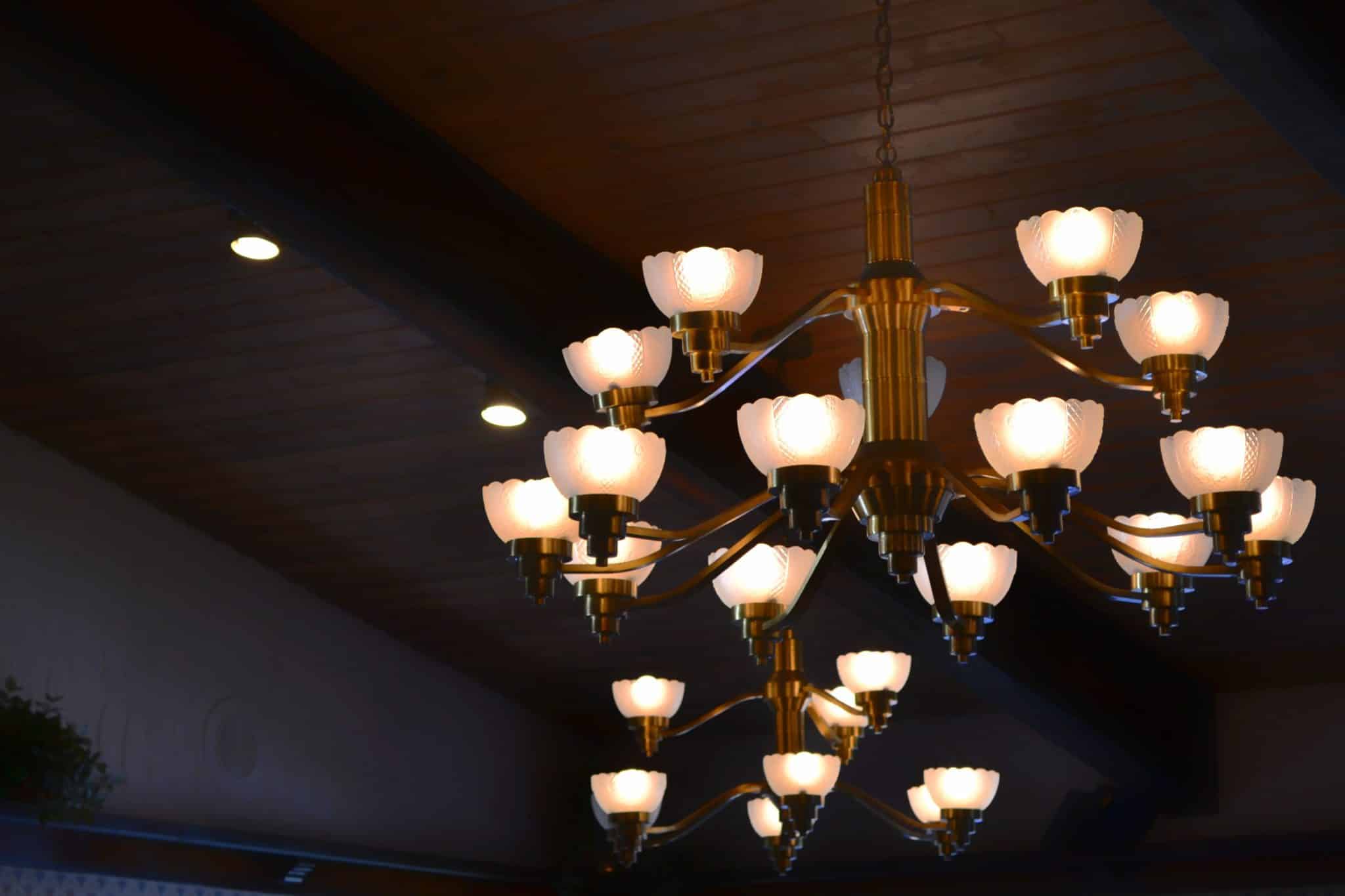


Gold and brass have dominated lighting for years, but a black chandelier often solves problems a warm metal can’t. It depends on the room’s walls, its existing hardware, and how much contrast you want overhead.
What Black Does Differently
Black reads as an outline. Against a light wall or ceiling, a black frame draws a crisp silhouette, so the shape of the chandelier becomes the main event. Gold and brass work through reflection; they glow and catch light, which makes them feel warmer but softer at the edges. That difference is why black suits sculptural or geometric designs, while brass suits fixtures where shine matters more than outline.
Rooms Where Black Wins
White or pale walls are the clearest case. A black branch or ring chandelier against a white ceiling gives you strong contrast without adding color. Black is also the easier choice in rooms with mixed hardware, because it sits beside nickel, brass, and bronze without competing. Farmhouse, industrial, and modern kitchens with black cabinet pulls or window frames are natural fits.
It also works in rooms with a lot of wood. A black frame against warm oak or walnut gives definition, where a brass fixture can blend into the wood tones.
Black vs. Gold vs. Brass Chandelier by Room Condition
|
RoomCondition |
Black |
Gold |
BrushedBrass |
|---|---|---|---|
|
Whitewalls,whiteceiling |
Strong |
Good |
Good |
|
Darkwallsorceiling |
Weak |
Strong |
Strong |
|
Mixedhardwarefinishes |
Strong |
Fair |
Fair |
|
Lotsofwarmwood |
Strong |
Fair |
Fair |
|
Formaltraditionalroom |
Fair |
Strong |
Strong |
|
Blackwindowframes |
Strong |
Good |
Good |
Where Gold or Brass Is the Better Call
Dark rooms are the main exception. Against navy, charcoal, or deep green walls, a black chandelier can almost disappear, while gold or brass stays visible and adds warmth. Very formal rooms with traditional detailing also tend to suit warm metals, especially when combined with crystal. And in tall rooms, reflective finishes hold their presence at a distance better than matte black does.
| Situation | Better finish | Reason |
|---|---|---|
| Navy or charcoal walls | Gold or brass | Black loses its outline |
| High ceiling, 16 ft+ | Gold or polished | Reflection carries further |
| Small white kitchen | Black | Crisp contrast, no glare |
| Oak-heavy living room | Black | Defines against warm wood |
| Formal crystal dining room | Gold | Matches traditional detail |
Sizing a Black Fixture
Because black reads as a solid outline, it carries more visual weight than a brass fixture of the same diameter. In a smaller room you can often go slightly smaller with black and still get presence.
In a large or tall room the reverse applies: a black fixture needs to be a bit bigger than you might expect, since its matte surface doesn’t catch the eye from far away. The usual starting point still holds: room length plus width in feet equals a baseline diameter in inches.
Combining Black with A Second Finish
Black chandeliers with brass or gold accents, such as a black frame with gold sockets, are a useful middle ground. They keep the crisp outline while picking up warm hardware elsewhere in the room. Keep it to two finishes on the fixture itself, or the design starts to look busy.
Matte, Satin, or Textured Black
Black isn’t one finish. Matte black absorbs light and gives the crispest outline, but it can show fingerprints and dust more than you might expect. Satin black has a slight sheen that softens the look and hides marks a little better.
Textured or hammered black adds a hand-made quality that suits farmhouse and rustic interiors. Powder-coated finishes are generally the most durable, resisting chips and fading over years of use.
Shades and Glass Change the Effect
A black frame with clear glass shades feels open and light. With frosted or opal glass, the light becomes softer and the black frame stands out more. Black fixtures with exposed bulbs give an industrial look, while black with crystal accents creates a strong contrast between dark metal and bright facets, a combination that suits current transitional rooms.
| Black finish | Look | Best for | Upkeep |
|---|---|---|---|
| Matte | Crisp, flat outline | Modern, minimalist | Shows dust |
| Satin | Softer sheen | Transitional | Easier |
| Textured / hammered | Hand-made feel | Farmhouse, rustic | Hides marks |
| Black with gold accents | Warm contrast | Mixed-metal rooms | Moderate |
Black Over Kitchen Islands and Dining Tables
In kitchens, black fixtures pair naturally with black faucets, pulls, and window frames, which have become common in recent renovations. Over dining tables, black works especially well above light wood or white tabletops, where the contrast frames the table. Over a dark wood table in a dark room, consider a warm metal instead.
Repeating Black Elsewhere in The Room
A single black chandelier in an otherwise light room can look like it’s floating on its own. Repeating black in two or three small places, such as a picture frame, lamp base, curtain rod, or chair legs, gives the fixture a visual connection to the rest of the room.
The same applies to gold and brass. A finish that appears only once overhead tends to look like an afterthought, while one that repeats looks planned.
Choosing Between Them
If your room is light-toned, wood-heavy, or full of mixed metals, black is usually the stronger choice. If it is dark, formal, or very tall, gold or brass tends to work better.
Comparing a few matte black chandelier options against warm-metal versions of similar shapes is the fastest way to see the difference. Let the room’s contrast decide rather than the trend.