
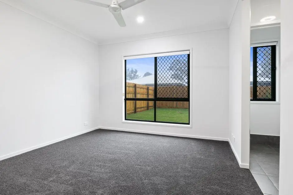
A house rarely feels finished simply because every room is furnished. The calm that people notice when they walk through a well-designed property usually comes from something quieter, which is a shared design language that carries from the front door to the back bedroom.
When colours, materials and shapes speak to each other, each space feels like part of one story rather than a separate project. Building that consistency takes planning, patience and a clear set of choices made early on. The ideas below explain how to create a unified look across every room without making the whole place feel flat or repetitive.
Getting the Groundwork Right From the Start
Many buyers begin choosing finishes one room at a time, only to find later that the spaces no longer feel connected. The problem often starts with the builder, because a builder who treats each room as a separate package leaves owners to piece the overall look together on their own.
An experienced new house builder that plans the interior and exterior side by side can solve this before construction even begins. Working with Domaine Homes gives buyers customisable facades, interior and exterior colour schemes, and an online visualiser tool for testing finishes before anything is built. Having those choices laid out in one place makes it far easier to keep every room aligned from day one.
Choosing a Core Colour Palette
Colour is the fastest and simplest way to tie a property together. A simple approach is to pick three to five shades and use them in different amounts throughout the house. One shade becomes the main wall colour, another works as a supporting tone, and one or two act as accents that appear in cushions, artwork or a feature wall.
The trick is to keep the undertones consistent. Warm whites sit comfortably beside soft greige and timber, while cool whites pair better with charcoal, slate and crisp blue. Mixing warm and cool undertones at random is one of the main reasons rooms feel disconnected, even when each one looks fine on its own.
Repeating Materials and Textures With Purpose
Materials carry a design story just as strongly as colour does in any house. Choosing a small set of finishes and repeating them in different rooms creates a quiet sense of rhythm.
Timber used on a dining table might appear again in bedside tables, a bathroom vanity or open shelving in the laundry. A particular stone or tile finish in the kitchen can echo in a powder room or around a fireplace.
Texture matters too. Linen, wool, leather, matte ceramics and natural stone each bring a different feel. When the same few textures reappear across the house, the eye picks up on the pattern even if a visitor cannot quite explain why everything feels so settled.
Letting Flooring Create Natural Flow
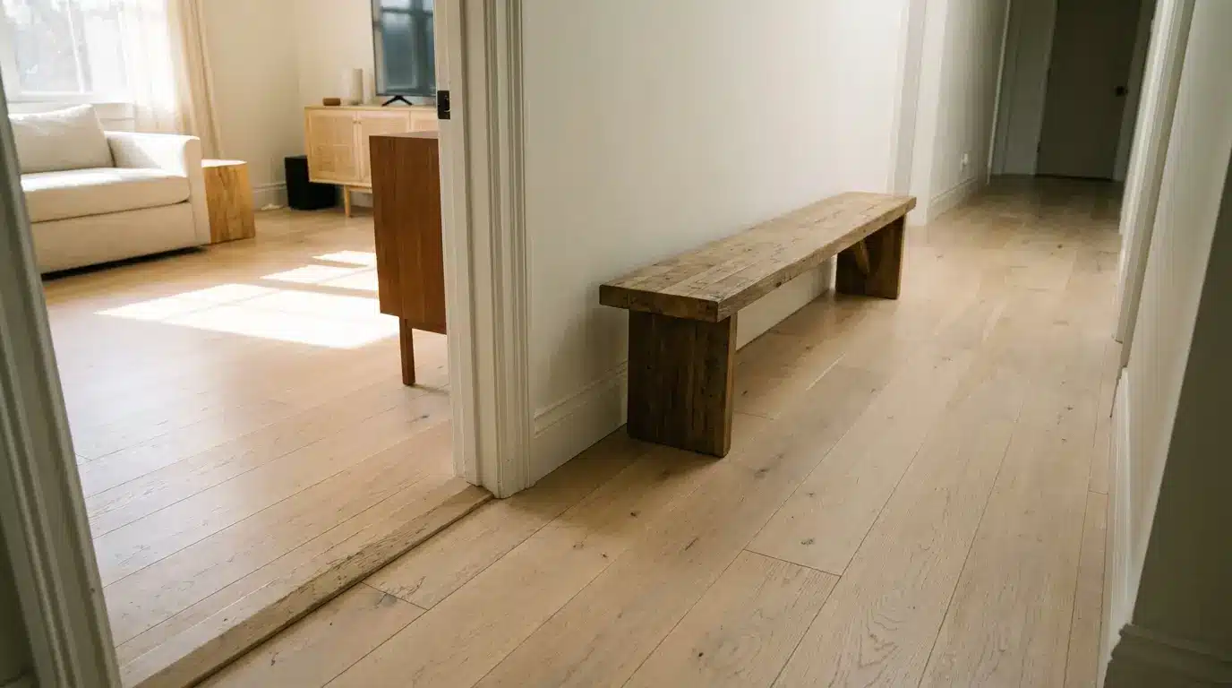
Flooring is one of the most powerful tools for unity because it runs underfoot from one space to the next. Using the same floor finish through the main living areas, hallways and kitchen removes visual breaks and makes the layout feel larger and more open.
Where a change in flooring is needed, such as moving from timber or vinyl planks to carpet in the bedrooms, choosing tones that sit close together keeps the shift gentle. Wet areas can use tiles in a shade that relates to the main floor rather than fighting against it.
Keeping Hardware and Fixtures in the Same Family
Small details often decide whether a house feels thoughtfully planned or pieced together. Door handles, cabinet pulls, tapware, light switches, and towel rails all add up. Choosing one main metal finish, such as brushed nickel, matte black or warm brass, and using it consistently gives the interior a polished, finished look.
A second finish can be introduced deliberately in one or two places, perhaps in a statement pendant or a kitchen mixer, but it should feel like a clear choice rather than an accident. Keeping the shape of handles and fixtures in a similar style, whether rounded and soft or square and sharp, adds another layer of harmony.
Using Lighting to Connect Spaces
Lighting shapes mood, and a consistent approach to it helps rooms feel related after dark as well as during the day. Keeping the colour temperature of globes the same across living areas avoids the jarring effect of a bright white kitchen beside a warm yellow lounge room.
Pendants and wall lights can follow a shared style or material even when their sizes differ. A family of fittings in the same finish, used in the entry, dining area and main bedroom, creates a link that guests notice as they move through the house.
Treating Doorways and Sightlines as Transitions
Standing in one room and viewing the next is where consistency is tested most. Long sightlines through hallways and open-plan areas should show a pleasing view, with colours and finishes that lead the eye forward instead of stopping it short.
Painting door frames and skirting boards in the same shade throughout helps stitch rooms together.
Artwork placed at the end of a corridor or framed by a doorway gives the eye a natural resting point and turns simple movement through the house into a more considered experience.