

Your room has all the right pieces, but something still feels off. You cannot identify the issue, and that can be the most frustrating part of decorating.
Many spaces that feel unsettled are missing one important design principle: repetition in interior design.
This does not mean matching furniture sets or using identical patterns everywhere. It means repeating colors, textures, shapes, or materials in the right places to create a connected look.
When used correctly, repetition helps a room feel balanced, comfortable, and complete without requiring a full redesign. The right elements, placement, frequency, and common mistakes all play a role in creating a cohesive space.
What Is Repetition in Interior Design?
Repetition in interior design is the intentional reuse of a visual element (color, shape, texture, pattern, or material) across multiple points in a space to create visual rhythm and cohesion.
Picture a dining room where the pendant shade, window blind, and dining chairs all share the same woven texture. The objects are entirely different: a ceiling fixture, a window treatment, and seating.
Yet that single repeated element produces immediate cohesion without a matching set in sight. Repetition in interior design is not matching.
A five-piece furniture set creates repetition, but it’s rigid and flat. Identical items remove the contrast needed to keep a space visually engaging.
Why Repetition Matters in a Room?
A well-designed room does not announce itself. It simply feels right the moment you enter, and most people cannot explain why. Repetition is usually the reason.
- Creates Visual Order: Repetition gives the eye a framework of visual anchors it recognizes and expects, producing the sense of order even in rooms with varied styles or complex palettes.
- Guides the Eye Naturally: Repeated elements act as a trail. A color used in a rug, then a throw pillow, then a piece of artwork, pulls the eye across the room in a deliberate sequence rather than letting it snag and stop.
- Connects Separate Areas: In open-plan spaces in particular, repetition is what makes a living area and a dining area read as one cohesive environment.
- Reduces Visual Confusion: The eye searches for a pattern and finds none, which registers as restlessness or the vague sense that a room feels off. Repetition resolves that search before it starts.
Together, these effects explain why repetition in interior design is foundational rather than decorative. It is the underlying logic that makes everything else cohere.
Key Elements that Create Repetition
The most commonly repeated elements in interior design are color, shape, texture, pattern, and architectural features.
In a living room, this might look like brass appearing in the light fixture, cabinet pulls, and mirror frame, a curved sofa edge echoing an arched doorway, and a woven texture running across the rug, throw, and side chair.
Any element needs to appear at least three times for the brain to register it as intentional. These are the core elements to create repetition in interior design.
1. Color and Finish
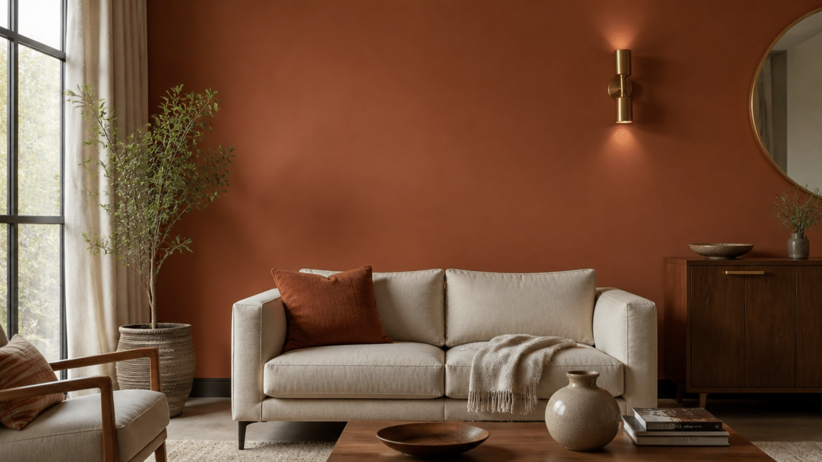
Repeating a color does not mean using the exact same shade on every surface. The same hue at different saturations still counts because the brain groups by color family rather than by precise value.
A deep terracotta on a feature wall, a softer terracotta on a cushion, and a terracotta-toned ceramic on a shelf all register as connected.
Tip: Repeat a hardware finish across at least three fixtures before introducing a second metal tone.
2. Shape and Form
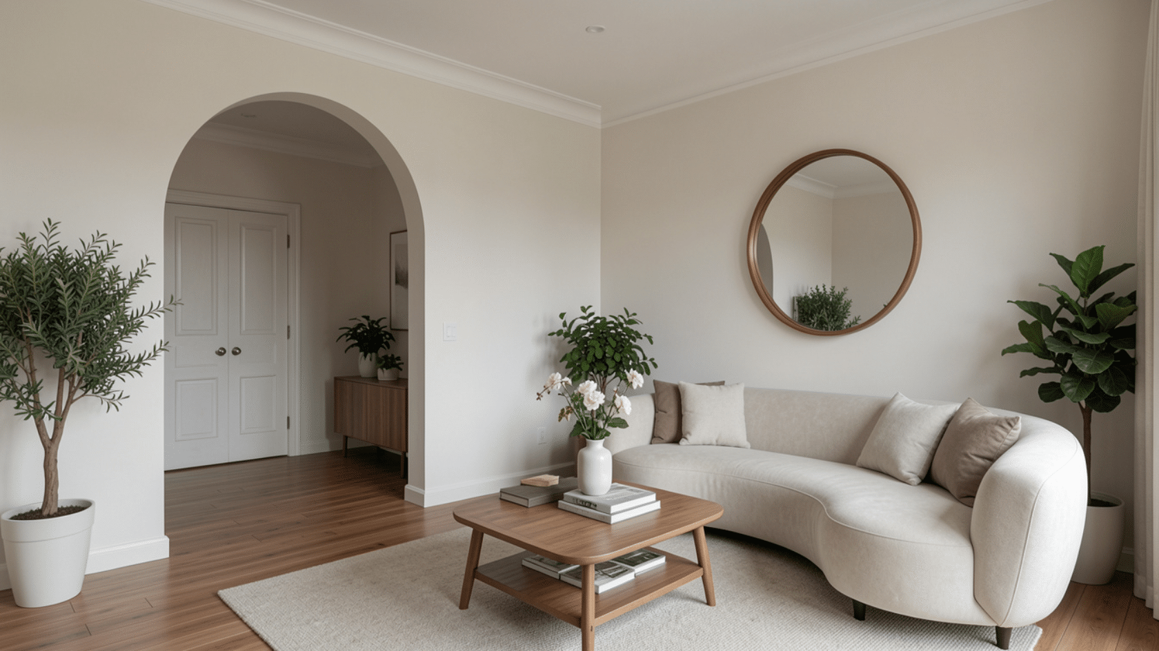
When a room has an arched doorway, echoing that curve in a round mirror, a curved sofa arm, or arched cabinet doors reinforces the architecture rather than fighting it.
The same works in reverse: a room with no architectural curves can introduce a consistent curved motif through furnishings and artwork frames to create softness and rhythm.
Tip: Pick one dominant shape (curved or geometric) and carry it through at least three separate objects before introducing a contrasting profile.
3. Texture and Material
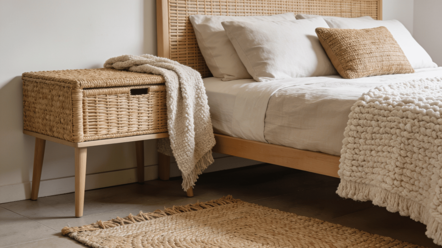
Texture repetition in interior design does not require identical materials. Rattan, jute, and seagrass are different materials, but they all trigger the “natural woven” perceptual grouping in the brain.
The same applies to boucle, velvet, and chunky-knit fabrics: distinct materials that share a tactile quality and read as cohesive when arranged across a sofa, a stool, and a cushion.
Tip: Instead of repeating one exact fabric, repeat a material quality (matte, woven, smooth, nubby) across three or more surfaces for cohesion that feels considered rather than uniform.
4. Pattern and Scale
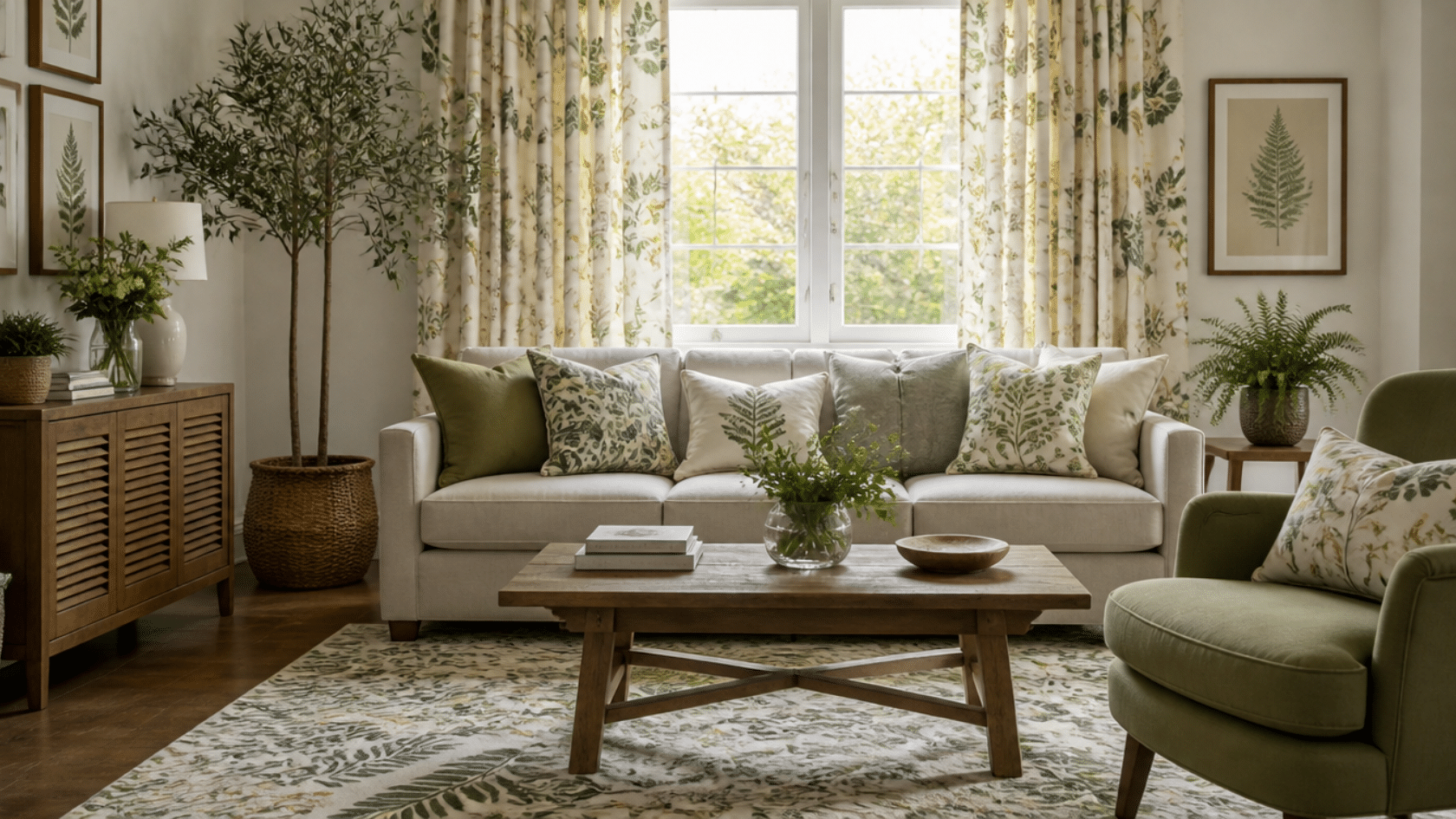
Repeating a pattern does not mean using the same cushion fabric on every surface. Carrying the same geometric or botanical motif at different scales adds depth rather than monotony.
Large-scale on curtains, small-scale on cushions, and a mid-scale version in a rug keep the pattern family consistent while giving the eye variation to move between.
Tip: When working with a patterned fabric, look for the same motif in a smaller or larger repeat for a second surface.
5. Architectural Features
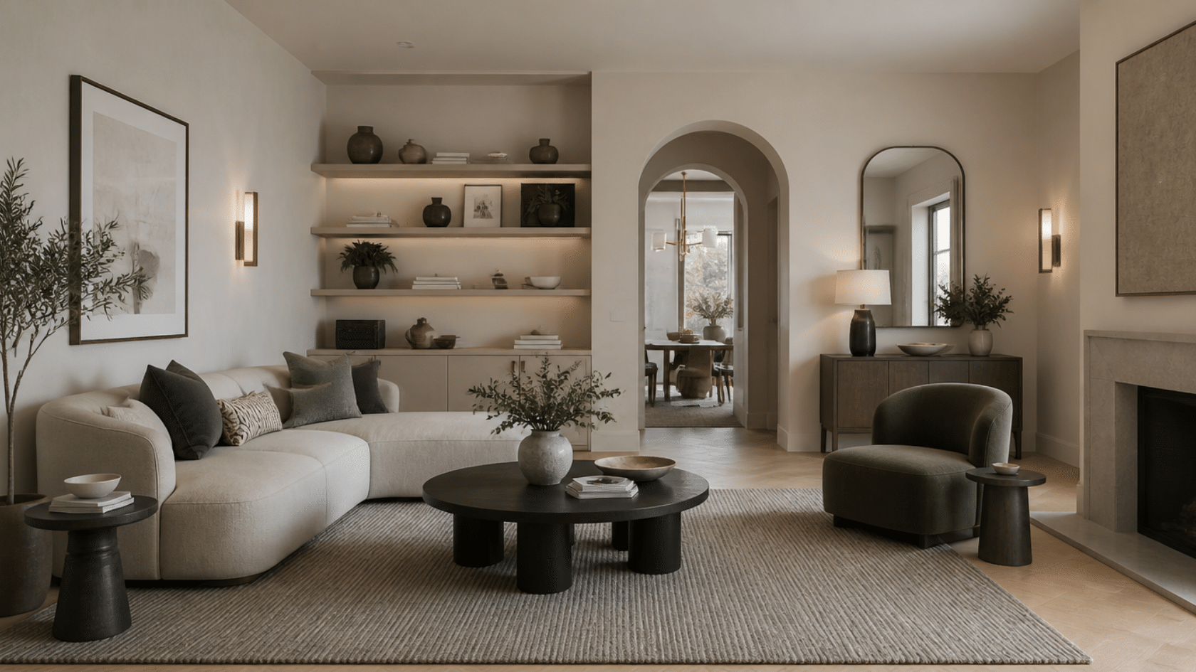
Columns, arched doorways, beamed ceilings, and paneled walls already do the repetition work for you. The job is simply to echo those features in the furnishings rather than ignore them.
An arched doorway pairs naturally with a round mirror or curved sofa. A beamed ceiling calls for furniture with strong horizontal lines.
Tip: Before hanging a gallery wall, pick one element like width, finish, or shape to keep consistent across every frame.
Room-by-Room Application Guide for Repetition
Each room uses repetition in a slightly different way. The idea stays the same, but the execution changes based on function, layout, and how the space is used.
A living room might repeat texture and color, while a kitchen leans more on shape and material. Understanding these small shifts helps you apply the principle correctly.
6. Living Room
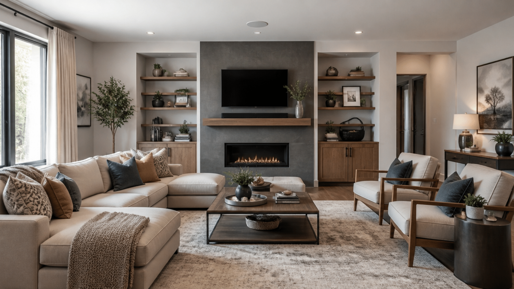
The living room needs repetition to connect multiple seating zones and décor pieces into a cohesive system. Without it, the space can feel scattered.
How to apply repetition:
- Repeat cushion colors across sofa and accent chairs
- Echo one accent color in multiple décor pieces
- Repeat shapes like round tables or curved sofas
- Keep metal finishes consistent in lighting and décor
Styling Tip: Place the same accent color in at least three separate zones: seating, wall décor, and one tabletop object to establish a clear visual link.
7. Bedroom
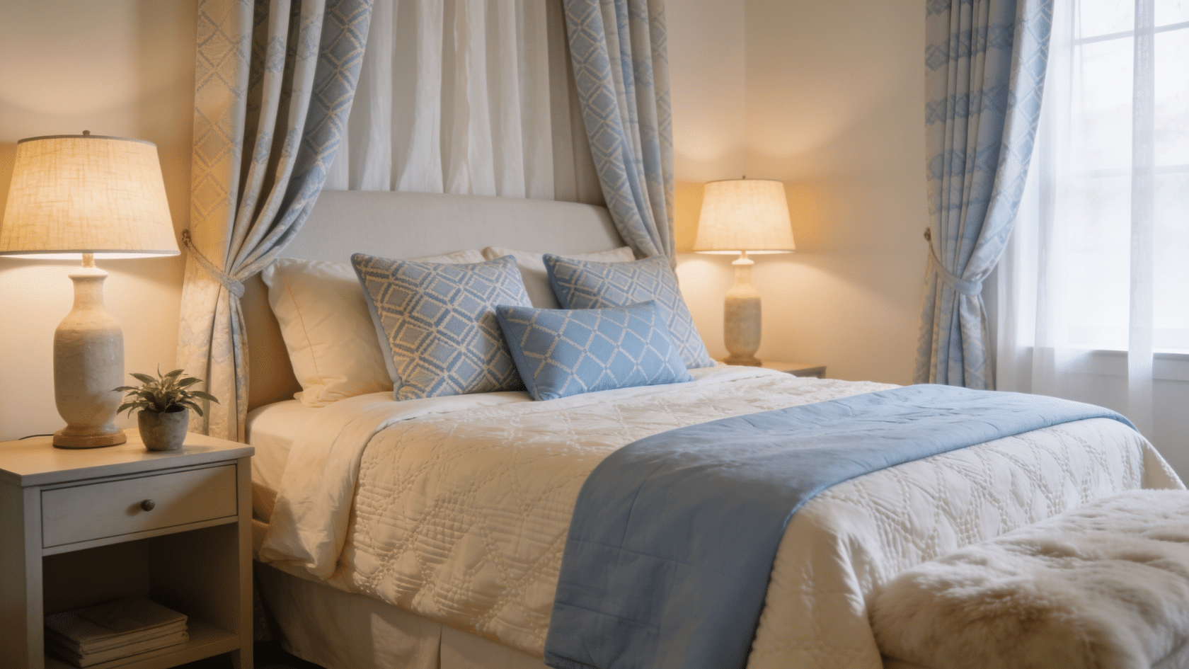
Bedrooms benefit from lighter, softer repetition that supports rest rather than visual activity.
How to apply repetition:
- Repeat bedding tones across cushions and curtains
- Mirror bedside lamps or tables for balance
- Use one fabric type across multiple soft elements
- Keep shapes soft and consistent
Styling Tip: Match one fabric tone across bedding, curtains, and at least one lighting element to maintain consistent visual rhythm.
8. Kitchen
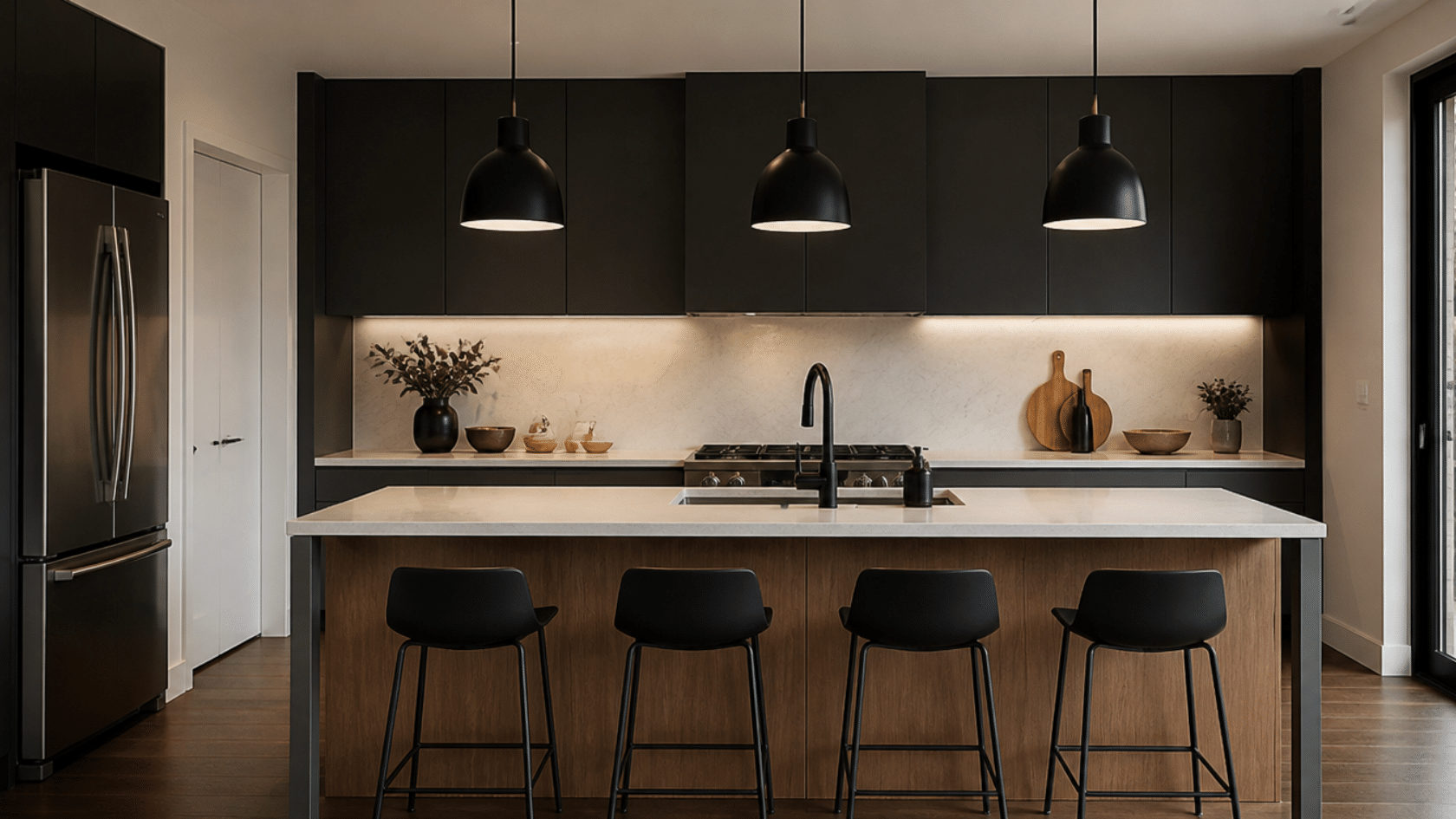
Kitchens rely heavily on the repetition of finishes and materials due to built-in elements.
How to apply repetition:
- Repeat cabinet finishes across all storage units
- Match metal tones in handles, taps, and lights
- Echo backsplash material in small accessories
- Repeat container and storage styles
Styling Tip: Apply a single metal finish (e.g., matte black or brass) to all hardware points, including handles, faucets, and lighting fixtures.
9. Dining Area
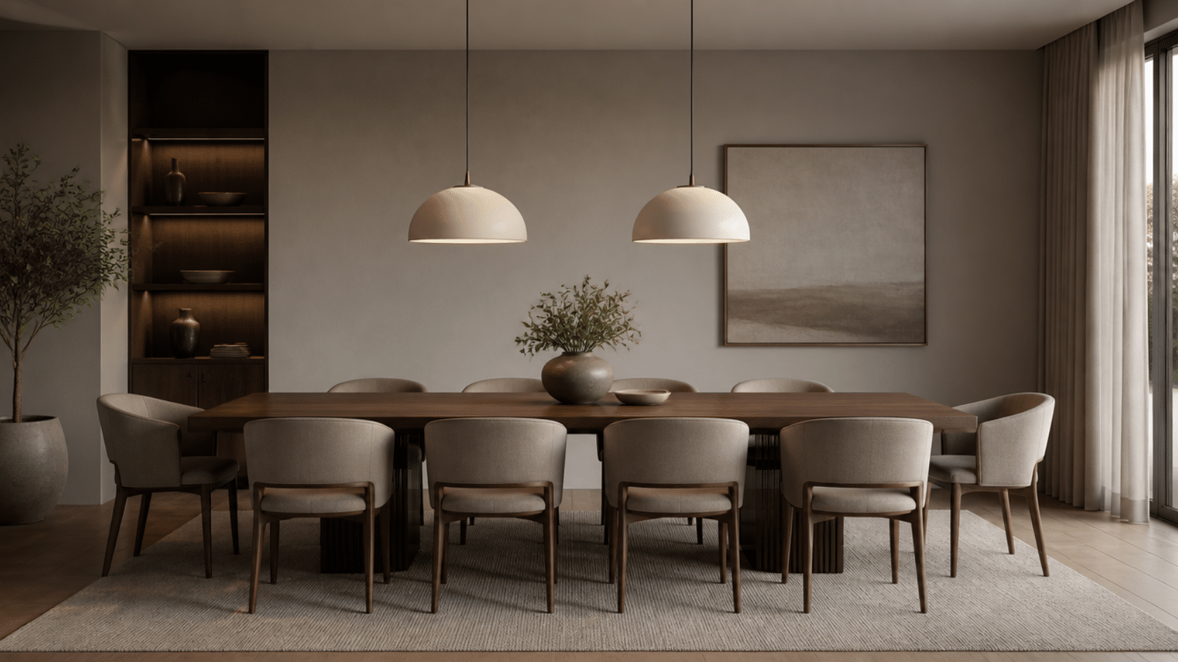
Dining spaces work best when repetition creates order around a central point.
How to apply repetition:
- Repeat chair shape or finish around the table
- Echo lighting shape above the dining table
- Use consistent tableware materials
- Repeat styling elements like runners or centerpieces
Styling Tip: Repeat one material (wood, glass, or metal) in at least three elements: seating, lighting fixture, and table accessories.
Rhythm in Interior Design
Rhythm in interior design simply means how the eye moves around a room when elements are repeated in a planned way.
When colors, shapes, or materials appear more than once, the space feels connected and easy to follow rather than random.
Repetition and rhythm are related but not the same. Repetition is the act of using the same element more than once, like repeating a color or shape.
Rhythm is the result of that repetition, where the repeated elements create visual movement. Repetition is what you place in the room, and rhythm is how those repeated elements guide the eye through the space.
Simple Checklist for Using Repetition
Use this simple checklist to quickly check if repetition in your space is working the right way. It’s a fast way to catch issues before committing to furniture, paint, or decor.
Go through each point honestly, based on what you actually see in the room. Small inconsistencies are easy to miss up close but tend to stand out once the space comes together.
| Check Area | What to Do | Quick Test |
|---|---|---|
| Color Repetition | Choose 1–2 main colors and repeat them across different parts of the room | Does the same color appear in at least 3 places? |
| Material Repetition | Repeat one material (wood, metal, fabric, etc.) at least 3 times | Is one material visible in multiple zones? |
| Shape Repetition | Echo similar shapes in furniture and décor (round, square, curved) | Do similar shapes appear in more than one area? |
| Balance Check | Mix repetition with variation in tone, texture, or form | Does anything feel overly repeated or too isolated? |
If these points are in place, repetition in interior design will feel clear, intentional, and visually balanced. The design reads as considered rather than accidental.
Missing even one of these repetitions in interior design can start to feel forced or mismatched. Spacing and material consistency separate a polished room from rooms that simply “match.”
Quick rule: If something appears only once or twice, it won’t register as repetition. If it repeats too much without variation, the space can feel flat.
Common Mistakes to Avoid in Using Repetition
Repetition in interior design helps create structure in a space, but small mistakes can easily disrupt balance and visual flow.
Check these common mistakes to make sure repetition in your space stays balanced and effective.
- Over-matching everything leads to a flat, staged look
- Repeating too many elements without contrast reduces visual focus
- Ignoring the balance between repetition and variation breaks visual flow
- Using repetition only once or twice makes it feel accidental instead of intentional
- Repetition in one area only can make a room feel uneven
- Too much identical repetition can reduce depth and interest
The key is controlled repetition that supports structure without removing contrast or variation. Get this balance right, and repetition becomes a tool that guides the eye rather than a pattern that overwhelms it.
Final Thoughts
Repetition in interior design is not a complicated concept. It is simply the difference between a room that feels finished and one that feels like it is still missing something.
You do not need new furniture or a bigger budget. You need the right elements appearing in the right places, at least three times, with enough variation to keep it from feeling flat.
Start with one element- a color, a finish, a shape- and carry it through the room deliberately. That single decision changes how the entire space feels.
Have a question or want to share how you used repetition in your space? Drop it in the comments below.
Frequently Asked Questions
Is Repetition Still Effective in A Room with A Lot of Natural Light?
Natural light shifts the way colors and textures read throughout the day, but it does not break repetition. Choose elements that hold their visual relationship across different light conditions.
Can Repetition Work Across Different Rooms, Not Just Within One?
Carrying one element, a metal finish, a wood tone, or a color family, across multiple rooms creates cohesion throughout the whole home. It is what makes a house feel like a single designed space.
Does Repetition Work Equally Well in A Small Room as In a Large One?
In a small room, two or three repeated elements are enough to register. In a larger space, those same elements need to appear more frequently to create the same sense of connection across the distance.