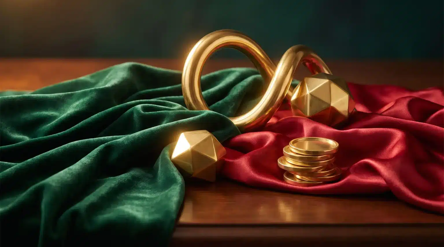
Colour trends are supposed to move fast. One year belongs to soft neutrals, another to electric brights, then somebody decides brown is exciting again. Yet three colours seem strangely resistant to fashion: green, gold and red.
They appear on packaging, restaurant signs, fashion collections, luxury interiors, games and festive graphics. Sometimes they look traditional. Sometimes designers give them a glossy digital makeover. Either way, they stick around.
That isn’t an accident. These colours carry ideas that are much older than branding itself: luck, wealth, energy, growth and celebration.
Gold Has Never Needed Much of a Sales Pitch
Gold has a useful design advantage. The material was valuable long before anyone started discussing brand identity.
Across different periods and cultures, actual gold has been connected with rank, sacred objects, royal dress and political power. Its shine made it visually hard to ignore, while its rarity gave it status. Museum collections show how gold was used to communicate authority in societies separated by enormous distances and very different traditions.
Graphic design inherited that baggage.
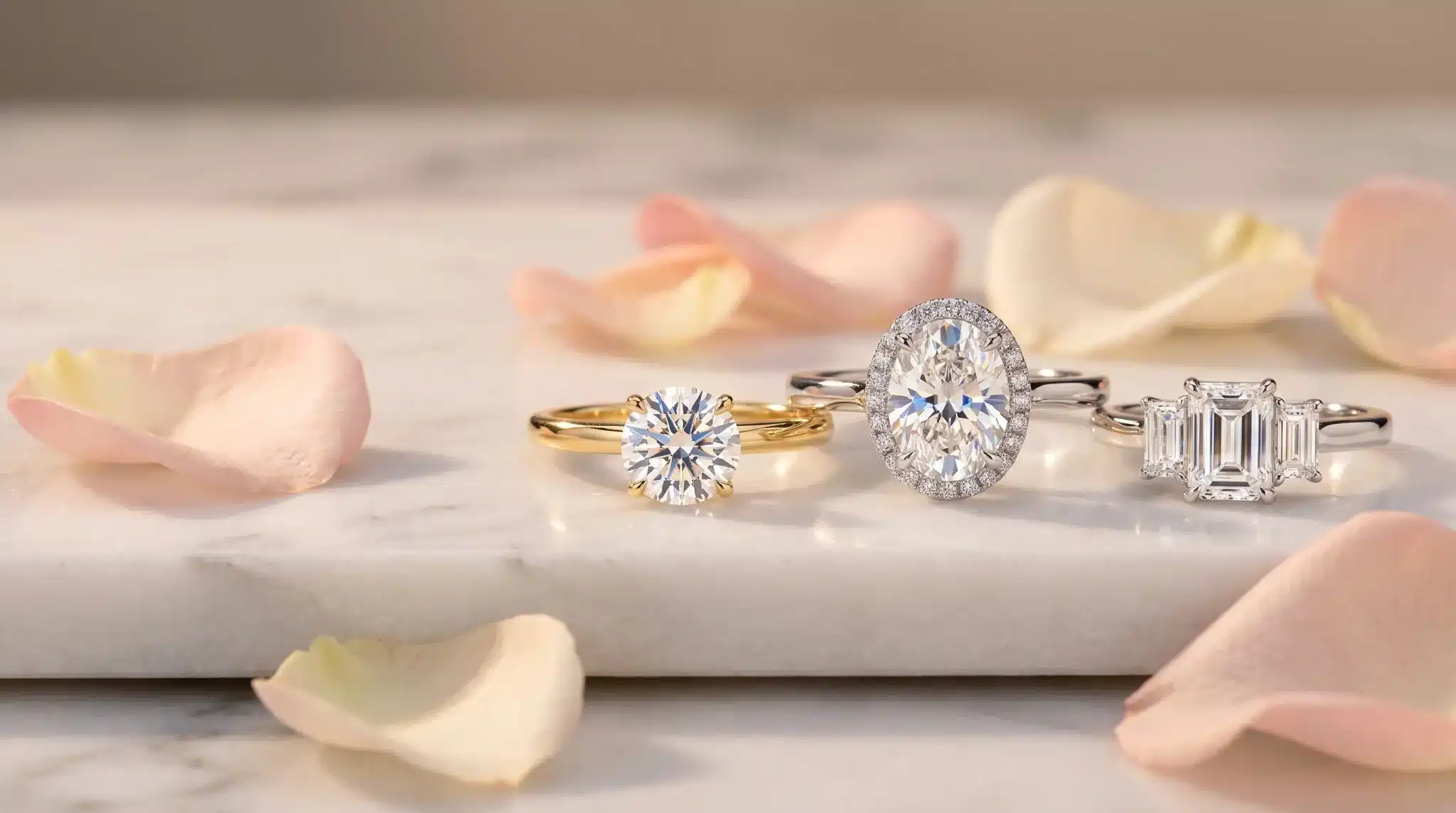
A gold line around a black package can make something feel more expensive before you’ve read a word. Metallic lettering on a bottle, menu or invitation does much the same job. Designers aren’t literally showing wealth. They’re borrowing its visual accent.
There’s also light involved. Gold reacts. It catches your eye as you move past it, which makes it feel less flat than many colours.
Digital design has found ways to fake that sensation with gradients, highlights and warm yellow tones. No metal required.
Green Feels Like Something Can Grow
Green carries a different kind of optimism.
It has an obvious connection with plants, renewal and the natural landscape, so it often creates a sense of stability rather than urgency. Current branding guidance still associates green with ideas around nature, balance and financial success.
That last association matters.
Money, prosperity and luck have helped green develop a second visual personality. It can be calm and organic in one context, then suddenly feel rich and competitive in another.
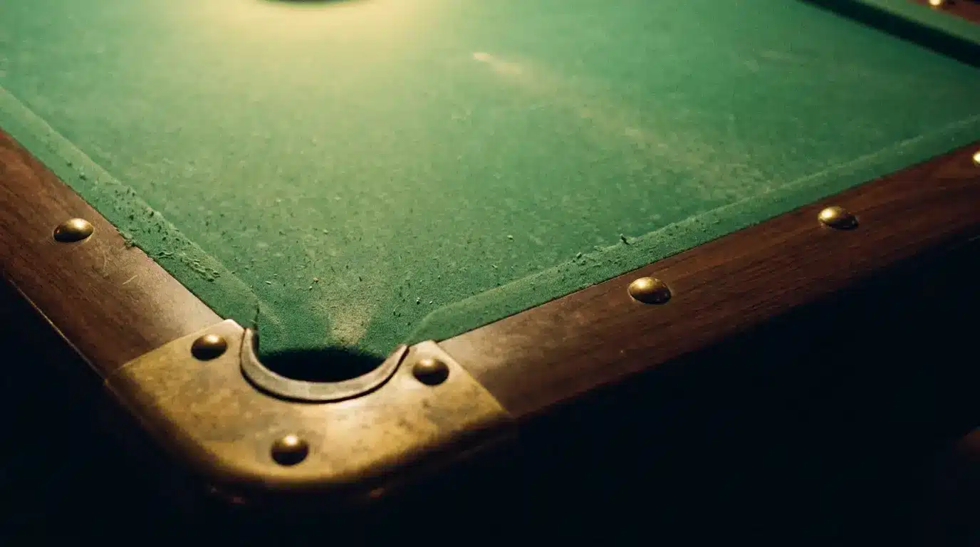
Casino design has used that flexibility for decades. Think of green felt tables paired with warm lights, dark wood and flashes of gold. The same visual memory still works on screens. Betinia Canada, for instance, uses a dark, green-led digital interface, showing how a familiar colour can anchor a modern entertainment space without making the layout feel old-fashioned.
Green doesn’t need to shout. That’s partly why it works.
Red Does the Shouting Instead
Then red walks into the room.
Designers use it when something needs attention. It feels hot, active and immediate. Adobe’s 2026 survey of graphic designers found red strongly associated with strength and power, which helps explain why it remains so useful in logos and visual identity work.
Put red next to green or gold and things get more interesting.
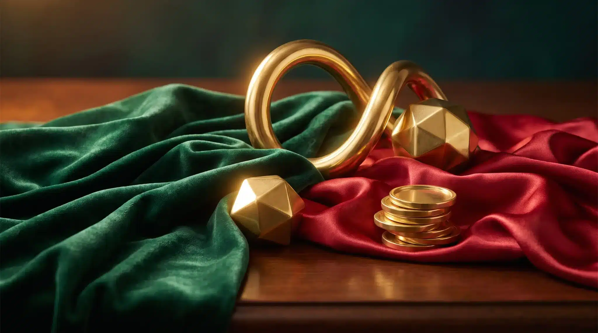
Green can provide the base. Gold suggests value. Red creates the pulse.
That combination has appeared so often in festive decoration, hospitality, gaming and luxury graphics that it carries a certain theatrical quality. You almost expect velvet curtains, polished brass or a beautifully excessive box tied with ribbon.
And yes, sometimes excessive is the point.
Minimal design gets plenty of attention, but humans still enjoy visual drama.
Old Colours, New Clothes
What makes these colours survive isn’t strict symbolism. Meanings change between cultures and contexts, and designers know better than to assume one colour says exactly the same thing everywhere.
Their real strength is flexibility.
A muted forest green with brushed gold can feel heritage-driven. Acid green beside chrome gold becomes futuristic. Deep burgundy can replace bright red and turn the whole palette quieter and more luxurious. Change the typography and texture, and suddenly the same three-colour family belongs to another decade.
That feels especially relevant in 2026. Current design forecasts are bouncing between clean simplicity, deep natural tones, tactile textures and intentionally imperfect graphics. Yet familiar colours keep slipping back into the mix.
Trends change their clothes. Certain visual instincts stay put.
Green promises possibility. Gold gives an object a little ceremony. Red says something is happening.
Perhaps that’s why designers never really left them behind. Luck, after all, has always needed good art direction.